


Automotive
Gem Car
An infotainment system and companion app for Gem Car.
Growl is a cooking app that reads each step and waits for you. Every image, clip and narration generated by a pipeline I designed. Design system, SwiftUI app, backend, built end to end with Claude Code.
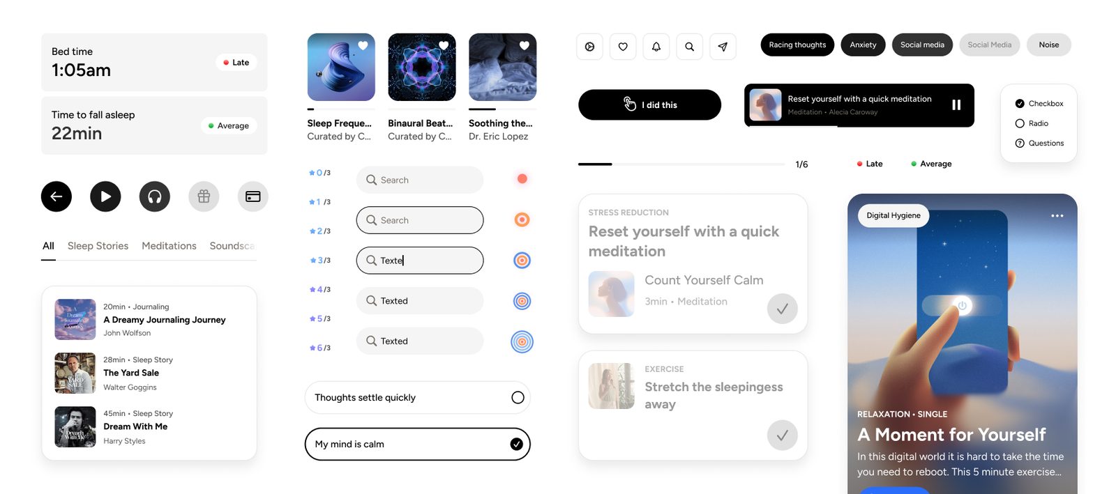
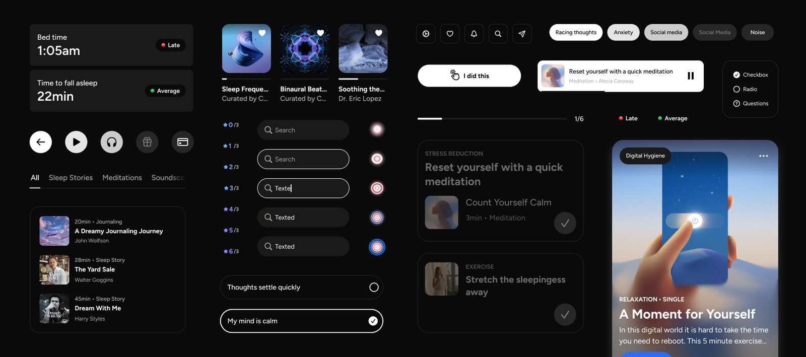
Calm Classic captured as a system with engineering; Calm Sleep built from scratch on it in four months; Calm Health adopted it for a product still in build. A new vertical is a set of values, not a new library.
Calm's first new product in twelve years. Personalization grounded in seven sleep levers, and the lesson that legibility has to come before personalization.
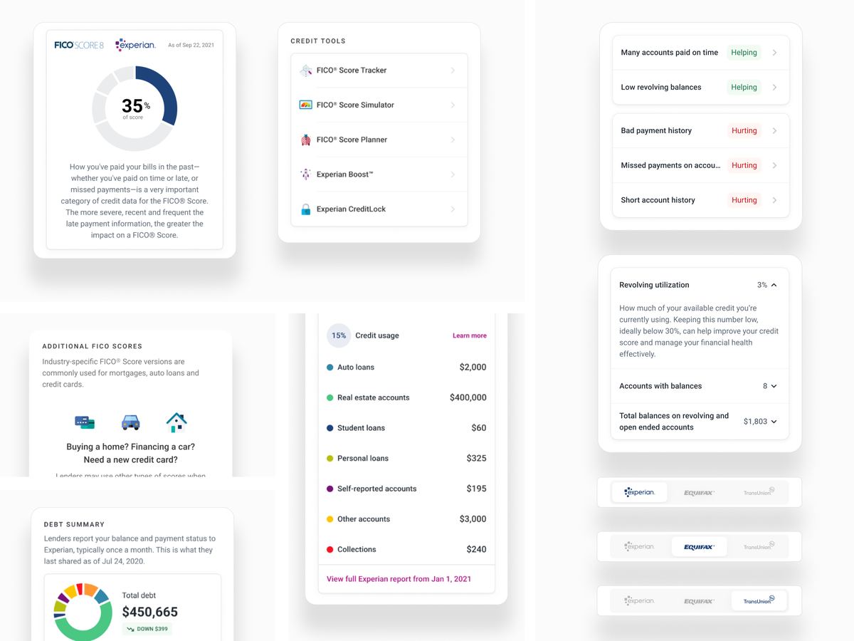
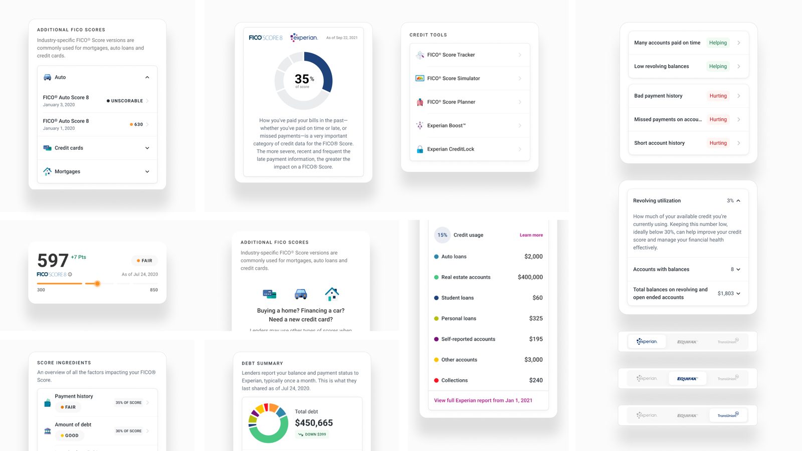
CreditHub: one Experian tab answering the three questions people actually came with, shipped in three tested phases across web, iOS and Android.
You rarely find a designer who balances elite visual craft with the systematic thinking required for modern product development.
Sang H., VP of Design, Calm
Four phases in order. Dashed tools are planned, not shipped.
Fourteen roles on one product. Hover a tool for what it does here; open a seat for what it produces and how it is directed.
Growl reads each step aloud, waits for you, and listens. Every image, clip and narration in the app is generated by a pipeline I designed. Built with Claude Code under direction.
Nine milestones from first commit to the launch gate, May 21 to October 14. Drag the handle or use the arrows.

Shortcuts to what you saved and what is cooking this week, then the recipes you liked but have not made yet. The green bar is the player: a cook is in progress, and it follows you through the app.

One field, then rows chosen for you and the catalog by cuisine. Every card carries the total time up front, because that is the first question in a kitchen.

Cooking time, overall time, and the clock time the dish will be ready if you start now. Level, step count, one play button. Nothing to read before deciding.

The whole recipe as a list, each step with its own minutes, so a ninety-minute rise is visible before you commit, not discovered in the middle.

Serving size and measurement system are controls, not footnotes. Change either and every quantity follows. Tap an ingredient to send it to groceries.

Thirteen items from this recipe, counted on the tab. Add all, clear all, or pick. The list is the bridge between planning on the couch and cooking at the stove.

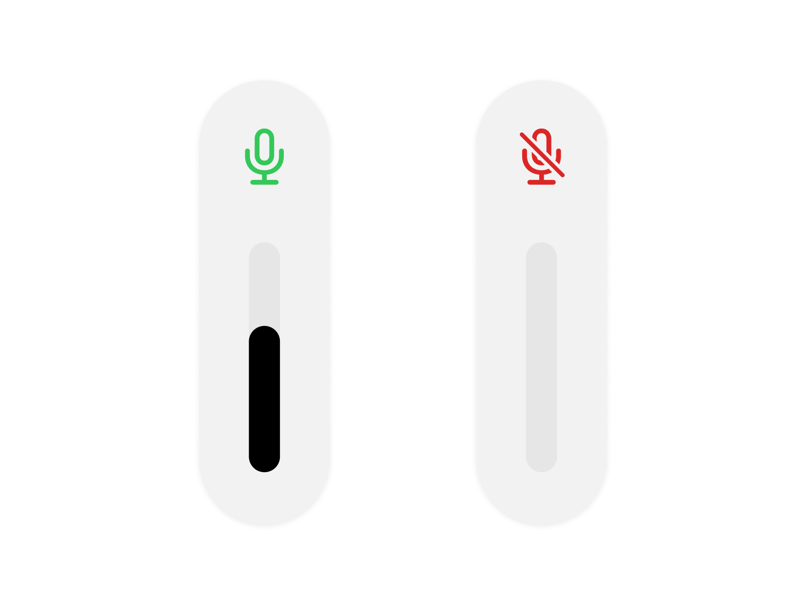
The current step, read aloud, with the key ingredient underlined. The pill is red: the mic is closed while Growl speaks, so it never hears itself. Hands stay on the food.

Some steps are better watched than heard. Tempering eggs is one. Video is a bonus on a step, not a format for the recipe, so the catalog is not limited to what was filmed.

The mic turns green the moment narration stops. Say Next, Back, or Repeat, nothing else, and it happens. Dark on purpose: this screen runs on a counter, across the kitchen.

Three minutes for the pastry cream, with the alarm time shown. Timers come from the step itself, and with Live Activities they keep running on the Lock Screen.

When the mic is live and when it is not, in the app’s own words. An affordance nobody can see is not an affordance, so the rule is written down where it applies.

Recipes, collections, and cookbooks you assemble yourself: a holiday menu, a city, a Tuesday. Liked Recipes is the first shelf because it fills itself.

Name it, add to it, give it a cover. Under the recipes you chose, Growl suggests more from what you have liked, so a holiday menu grows from the dishes you already wanted to make.
The shipped app on device, in the order a cook meets it: find a dish, see what it costs in time, shop it, then cook it with your hands on the food while Growl reads. It plays through on its own; tap a dot to stop on one, or the screen to see it large.
A 500-recipe catalog, every step narrated, every image generated, designed and built and produced by one person in five months, feature-complete for launch.
Measured October 16, 2026
Voice is the thesis, and the hard part was not recognition. It was deciding when the app is allowed to listen, and being honest about it. The microphone opens only in the gaps between narration, because while narration plays the app would hear itself. The pill reads red while Growl speaks and green when it is listening.
The pushback. When per-step video shipped, should "play video" work during narration? Letting one command through the closed mic window was technically clean and failed on honesty: an affordance nobody can see is not an affordance, and a pill reading red while secretly accepting a command makes the pill a lie. The tap stayed; voice stayed for the hands-free moment it was built for.
Growl reads it, the pill goes green, and the next step arrives. Seventeen seconds, unedited.
A recipe was either video, every step a clip, or audio, every step a still. That forced one answer for all eighteen steps of a dish where three need motion and fifteen do not. The test was always whether watching teaches something the narration cannot, and that is a question about a step. The catalog went from 617 clips to 77. The Watch & Cook browse surface was deleted in the same change.
The cost score informs the format and never decides it. The hardest steps to generate, pleating, rolling, forming, are the ones a cook most needs to see.
An early scoring script ranked recipes by how well they would render, and nothing weighed demand against it. Measured later: 50 soups and 2 salads out of 173 recipes. Every step of that reasoning was sound and the outcome was nobody's plan. Fifty more recipes went in and nothing moved; the redistribution was a deliberate act at a specific moment, not drift. The fix was structural: which dishes is answered by demand, what a US home cook makes on a Tuesday, and which format by whether motion teaches. Soup & Stew went from 29% to 14% of the catalog, not the 11% projected, because soups kept being added. Seafood went 3 to 27, Salad 2 to 15. Sushi went 2 to 3, because an empty category is not automatically worth filling.
Three points from git. Bars are share of the whole catalog; the dish-type field is multi-value and nullable, so rows do not sum to it. Soup & Stew is the headline, 29% to 14%. Sushi, hatched, is the control: the one empty category the rule said not to fill.
Every image and clip in Growl is generated. The pipeline is 106 scripts across thirteen steps, from sourcing a recipe against three references to the final audit. Not a single defect reviewed contradicted its prompt. Every one filled a silence, so the test on a finished prompt is not "is this accurate?" but "what would a stranger have to guess at?"
Four prompts produced four wrong images. Attempt four was better than three by every measure and failed anyway, because a chop lying in a crumb bed is coated underneath. The fix was not wording. It was the premise.
Three versions of the image reference rule, each measured against the same twelve known defects. Hover a bar for what the rule was and how it failed.
What I didn't build. Knives in motion. Three waves failed; cuts are two stills joined by a hard cut, at a third of the cost. Allergen filters. "Nut-free" is drawn in Figma and deliberately unimplemented, because a free-from claim being wrong can hospitalize someone, and the claim covers the whole dish. "Contains nuts" asserts nothing; "Nut-free" asserts everything.
CLAUDE.md is the project's memory: 2,018 lines and 36,512 words of rules, each tied to the failure that produced it. Figma is the single source of truth with three rules: never invent a value, 1:1 parity, build only what is marked Ready for Dev. Six parallel agents authored the final 542 image descriptions from one brief; all 41 contact sheets were then reviewed by eye. That found six defects the automated check passed. The numbers said 583 of 583 succeeded. A clean automated check is not a pass.
## 1. Step 4 — Write and approve Higgsfield prompts

*CLAUDE.md lines 1031–1040, under the heading at line 883.*

> [Editor's note, not part of the source: the "third attempt" below refers to a step in
> a Vietnamese summer-roll recipe that called for peeled, halved shrimp and kept
> rendering whole shell-on shrimp with heads, eyes and antennae.]

**Negative exclusion does not work on anatomy, and the evidence says it backfires.** The obvious fix is the one that fixed the sriracha bottle and the fried-egg lace — name the wrong thing and forbid it — so a third attempt spelled it out exhaustively: `every shrimp completely shelled with the head, tail, legs and antennae all removed, smooth naked coral-pink flesh only, no shells, no heads, no black eyes, no legs, no antennae and no tails anywhere in the frame`. It came back with the heads, eyes and antennae rendered *more* prominently than the attempt that never mentioned them. Three generations, three failures, the most explicit one worst.

**Treat this as a real boundary on the exclusion pattern rather than a one-off.** Exclusion works where the forbidden thing is a *separable object or artifact* that can simply be absent from the frame — a squeeze bottle, a lace pattern, a round dome. It fails where the forbidden thing is *inherent to the scene the model has been asked for*, because the words summon it and there is nothing left to render without it. Two shapes of inherent, both confirmed:

- **Part of the subject's own body.** The model cannot render "shrimp" while suppressing what it believes a shrimp is. Fixed by describing the object positively and never naming the missing parts: `eight split shrimp halves laid cut face up in two neat rows, each half a smooth curled crescent of firm white flesh with a bright coral outer edge` — first attempt, no heads, no shells, no antennae.
- **A state the scene canonically has, most often heat.** A saucepan belongs on a lit burner, so asking for one that is *off* the heat asks the model to withhold the defining feature of the setting. Moussaka's `enrich-the-bechamel` said "lifted clear of the burner with the flame plainly out" and rendered the pan **on a live flame** with a single yolk sitting whole and unbroken like a fried egg for six of eight seconds — a technique error, since yolks over direct heat scramble. Tom Yum's `finish-off-the-heat` — the step *named* for it — said "lifted clear of the burner and set down on dark matte stone with the flame plainly out" and rendered a lit blue flame for the entire clip, opening on an empty burner and animating the pot **onto** it.

**The fix in both shapes is the same: replace the negation with a positive relocation or a positive description.** Do not say where the vessel is *not*; give it somewhere else to be, and put nothing in the frame it could be misread onto — `standing on a thick wooden board on a dark stone counter, the whole frame filled by the board and the counter with no stove, no cooktop and no burner anywhere in view`. Name the destination, fill the frame with it, and let the absence follow from the framing rather than from an instruction to withhold. Where a step's whole point is that the heat is off, that is a claim about *location*, so shoot it somewhere a burner could not be.

[removed]

> [The removed line, 1040, counted how many prompts across the catalog still use the
> off-the-heat construction and pointed at the queue tracking the unreviewed ones.]
## 2. Audio recipes at batch scale — what 51 recipes in one wave taught

*CLAUDE.md lines 1420–1450, under the heading at line 1413.*

**The reference chain is the architecture, and its one failure mode is knowable in
advance.** Step 1 is a full establishing shot written out in words. Every later step
carries **step 1's job id** as its `medias` reference, so the whole recipe inherits one
surface, one light direction, one set of cookware from a single generation. That is what
makes cross-step consistency a property of the batch rather than something re-argued in
every prompt. **327 stills came back with 6 defects — 2.1%** — and five of the six were
the same thing: *the anchor imposed its vessel or its heat on a step that had legitimately
left both.* A step that moves the food into a baking dish, onto a wire rack, or off the
burner entirely is being asked to match a reference that contradicts it, and the
reference wins.

That first rule was *chain to step 1 by default; chain to the immediate predecessor
whenever the step changes vessel or leaves the heat*, and it fixed all five
first-attempt. **Wave 3 then showed it is a special case of the real rule, and it
misses the commoner half.** 323 stills, **15 defects — 4.6%**, of which **11 were
vessel drift**, and every one of the 11 is the same shape: *the step's reference did
not contain the vessel the step needed.* Two ways that happens, and only the first is
what the old rule describes:

- The step moves somewhere new, so the anchor contradicts it. (The old rule's case.)
- **The step continues in a vessel the anchor never showed.** Buttermilk Waffles'
  anchor is a hot waffle iron, so its batter was beaten *inside the iron*.
  Spanakopita's anchor is a sink, so the model invented a glass dish for one step and
  a ceramic one for the next. Chicken Piccata's pan sauce moved to a ceramic pan
  because the step before it was a plate of flour.

> **The rule: chain to the NEAREST PRECEDING STEP THAT ALREADY SHOWS THIS STEP'S
> VESSEL, falling back to step 1 when nothing does.** That subsumes both branches —
> a step that changes vessel finds no earlier match and falls back to the anchor,
> a step that stays in the pot finds the pot — and it is the only version that scored
> 12 of 12 against the wave-3 defects. [removed]

> [The removed clause, at the end of line 1450, named the script implementing the rule.]
## 3. The rule was wrong while the practice was right

Two instances of the same failure, in two different sections of the file. The second
explicitly cites the first.

### 3a. Cuisine (and fusion) tagging

*CLAUDE.md lines 182–184, under the heading at line 168.*

**Why it has to be this way: `cuisine` is the key to a browse surface, not a provenance record.** It drives Browse by Cuisine, Search's cuisine tiles and cuisine affinity. A US diner tapping *Chinese* means "the Chinese food I eat", so **Orange Chicken is Chinese** for the same reason Chicken Parmesan is Italian — even though Panda Express invented it in 1987. Tagging it American by birthplace would file it beside meatloaf and apple pie, and it would be missing from the one tile anyone would look in.

Settled 2026-09-29, after reasoning from the old wording twice and getting it wrong twice. The practice was already right; only the rule was incomplete.

### 3b. Step 1 — Create the recipes_master.json entry

*CLAUDE.md lines 715–734, under the heading at line 634.*

  **The `Salad` row said "primarily vegetables or grains" until 2026-09-30, and
  that clause excluded dishes the catalog already tags.** Shipped **Cobb Salad**
  carries `["Salad"]` and its own description is "chicken, bacon, egg, tomato,
  avocado and blue cheese" — protein-forward, and correctly tagged. A drafting
  agent reading the old wording concluded Chicken Salad should be `null`,
  flagged the contradiction rather than guessing, and was right to: **no shipped
  recipe has "Salad" in its name without the tag**, so the practice was never
  what the rule said.

  The clause is replaced by *recognised as a salad by the person eating it*,
  which is the same browse-surface test the cuisine section settled on — this
  field keys Library's filter and Search's tag matching, so a US cook tapping
  *Salad* and not finding Chicken Salad reads as a bug, not as taxonomy. The
  exclusions still do the real work and are unchanged: a **hot** protein, a warm
  roasted bowl, and a cold dressed side from another tradition are all still
  out, which is what keeps Sigeumchi Namul and Buddha Bowl from qualifying.

  Same shape of failure as the cuisine section, which was reasoned from twice
  and got wrong twice before its wording was completed. An incomplete rule is
  worse than a terse one, because someone careful follows it off a cliff.

Seafood Paella’s steps as Higgsfield prompts, written to the same visual rules as every recipe: dark walnut, linen, strong directional light, 9:16. The prompt is the design; the still is its output.

Step one, sear the seafood, as an object in R2 with its CDN URL. Every step image in the catalog lives here under the same naming, so the app never needs to know which recipe it is.

That still as the step card in the simulator, with the ingredients underlined and the mic closed while Growl speaks. Prompt to asset to screen, nothing in between by hand.

The tokens the screen is built from, as Swift: surface, text, border and brand, each resolving light and dark in one place, with a live palette preview on the device. The same tiered idea as Foundation, one person deep.
Seafood Paella in four views: the prompts that describe each step, the still those prompts produced, the step on device reading it, and the token file the screen is built from. Switch between them; nothing in the chain was done by hand.
Drag to compare. Cast Iron Ribeye, as designed and as shipped. Drag the divider to compare, drag anywhere else to pan, zoom with the control or ⌘ scroll, double-click to reset. The node reference under the slider is the Figma ID the SwiftUI file cites.
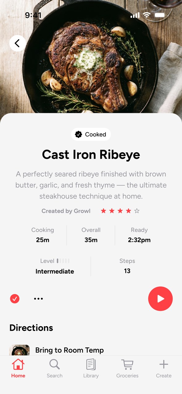
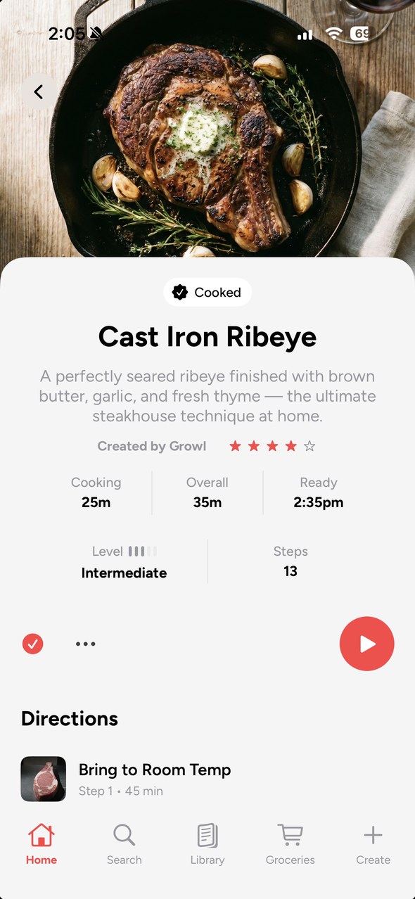
Drag to compare the Figma frame with the shipped SwiftUI screen. The node ID under the slider is the one the Swift file cites.
Stripped Figma file: tokens, components, Ready for Dev markers, and one logged divergence that owes Figma a correction.
Nothing in this vocabulary should be able to destroy state, because a misheard command must always be cheap.
A rule from the hands-free spec
4,794 narrated steps, 4,717 stills, 77 clips, 650 ingredient photographs, 7,029 ingredient links across 3,358 steps. 13 cuisines.
Every reviewed defect filled a silence in its prompt. The reference rule that came out of it fixed 12 of 12 known defects.
Clips cost about six times a still and fail 2.5 times as often. Chosen by demand and by whether motion teaches.
 FigmaSwiftUI, device
162 Swift files, about 45,700 lines, built under three Figma rules. Logged divergences owe Figma a correction.
LLC conversion, a rebrand across 500 data files, a privacy manifest, a rewritten policy, account deletion, a paywall that shows nothing rather than a price it cannot charge.
The 500-recipe gate was met October 14. Launch targeted for end of October, pending device QA, the Live Activity, and Apple. Zero users and zero retention data until then.
The scoring script that produced 50 soups ran for weeks before anyone counted. I'd put a demand check in front of any ranking that spends credits. When a system optimizes well and the result looks wrong, the objective is wrong, and the fix is to split the question, not re-weight the answer.
The same failure has been hit eight times: a check that matches a word rather than the thing it names. Each cost a batch. I'd write the general rule the first time a check passes something a human would fail, not the eighth.
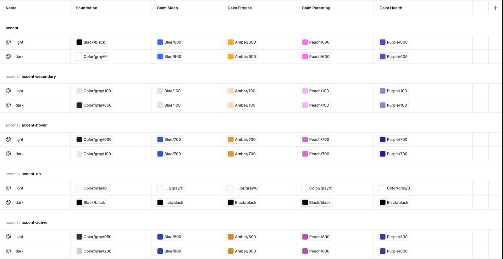
Primitives, semantics and a brand tier, so a new vertical is a set of values rather than a new library. Calm Sleep launched on it in four months. Calm Health adopted it for a product still being built.
One of the most thorough systems designers I've ever worked with. He refreshed our outdated design system, brought it to parity with industry standards, and built relationships with engineering so handoffs were smoother and production matched design.
Jeany N., Staff Product Designer, Netflix, formerly Calm
Calm's first new consumer app in twelve years shipped on the foundation in four months, Android followed about six weeks later from the same system, and Calm Health adopted it for a product that had not shipped yet, without a mandate.
From the export: 73 primitives, 26 semantics per mode, 5 brand files of 10 overrides each. Rebuilt for this page: 7 components, 22 variants, 24 text styles mapped to Dynamic Type and Compose, 4 elevation styles, a 14-token Motion collection, and every derived value marked as such.
Two tiers is the common setup and faster to author. The extra indirection cost authoring time up front and bought the ability to re-theme a whole vertical, light and dark included, without touching a component. Interaction states work the same way: a component picks a role, and the system resolves default, hover, active and disabled.
The one I re-spent. At Calm, disabled states resolved as a primitive at 40% opacity instead of carrying their own value. It halved the accent group and read correctly on every flat surface shipped, but a disabled control inside a dimmed container landed at 16%, and nothing in the system prevented it. The reconstruction spends the tokens: accent/accent-disabled and text/disabled are values, and the states figure below uses them.
Nothing inside the card changes between verticals. Pick a brand and a mode; every value resolves through a semantic token to a primitive, and the trace shows the path. Tokens are from my export of the system, resolved exactly as the file resolves them.
This is a paragraph for the component. It will show how the type layout holds across brands and modes.
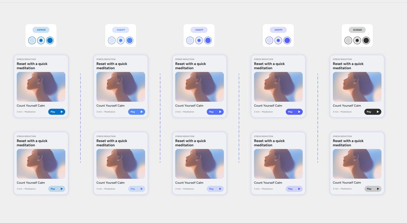
Pick a brand and a mode. The card never changes; the brand tier supplies every value. Sleep's accent shipped; the others are proof-of-concept values that show the tier working, not brand palettes.
73 primitives, 26 semantics per mode, four brand files that override only the accent family. Disabled and elevation tokens were unset in this export and are omitted.
A reviewer should be able to open the system, not take my word for it. Everything below runs on the Foundation token set, three collections and five brand modes, checked against the shipped Sleep screens. Three values differ from the file on purpose and are logged in the decision table: dark labels on the Parenting and Fitness accents, a label token for secondary buttons, and a tonal secondary in dark mode. Filter the semantics, switch brands and modes, check the states and the contrast.
| Semantic | Resolves to | Value | Used by |
|---|
Every semantic token, what it resolves to in the selected brand and mode, and which components read it. The brand tier only ever answers for the accent family; that is the whole trick. Type to filter.
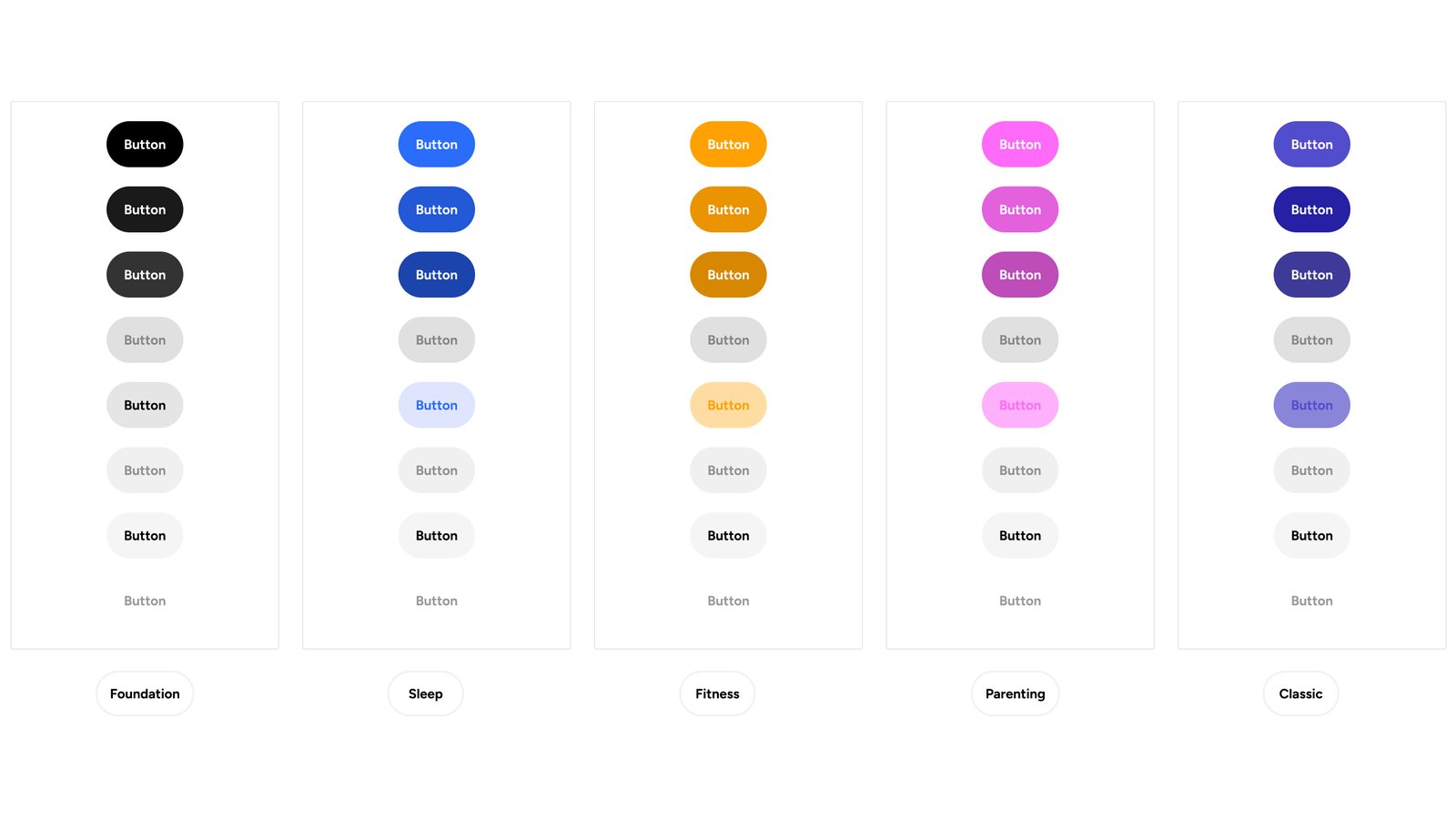
A component picks a role. The system resolves default, hover, active, focus and disabled, per brand, per mode. Disabled is a value, not opacity; focus is a 2pt ring on the accent. Nothing is redrawn.
Type and spacing from the export, drawn at size. Radius was not in the export; the four values were measured off the Sleep screens.
| Theme | Mode | Pair | Ratio | AA |
|---|
Four pairs for every brand and mode, computed from the tokens; translucent fills are composited over the surface before measuring. Three fixes came out of this audit: dark labels on the Parenting and Fitness accents, a label token for secondary buttons, and a tonal secondary in dark mode so the quiet action no longer outshouts the primary.
// Figma variable: Semantic / accent/accent
Light → {Brand.accent/light}     Dark → {Brand.accent/dark}
Brand mode Sleep → {Primitives.blue/600}   Parenting → {peach/600}   Classic → {gray/0}
// Code syntax on the variable
WEB      var(--accent-accent)
iOS      Semantic.accentAccent
ANDROID  Semantic.accentAccent
// Tokens.swift, generated from the export
enum Semantic {
    static var accentAccent: Color { Foundation.brand.accent }
    static var surfaceBg: Color { Foundation.semantic.surfaceBg }
}
// No literals in views. Button(role: .primary) resolves default, pressed, focus, disabled.
// Tokens.kt, generated from the same export
object Semantic {
    val accentAccent: Color @Composable get() = FoundationTheme.brand.accent
    val surfaceBg: Color @Composable get() = FoundationTheme.semantic.surfaceBg
}
// FoundationTheme wraps MaterialTheme: ColorScheme.primary = Semantic.accentAccent,
// onPrimary = accentAccentOn, surface = surfaceSurface, background = surfaceBg,
// so Material components inherit the brand without being rewritten.
FoundationTheme(brand = Brand.Sleep, dark = isSystemInDarkTheme()) { PrimaryButton("Continue") }
How it reaches code, on both platforms. The system shipped to iOS and Android from one source. Every variable carries three names, CSS, Swift and Kotlin, so the token a designer sees in Figma is the identifier an engineer types. On iOS the semantics resolve through a Foundation theme object; on Android a FoundationTheme wraps MaterialTheme and maps the color scheme onto the semantics, so stock Material components take the brand without being rewritten. Sizes and spacing export as points and dp from the same numbers. I designed directly in SwiftUI and Jetpack Compose with the iOS and Android engineers reviewing the builds; Android followed Sleep's iOS launch about six weeks later, from the same system with no separate library. For Calm Health, Spencer S., their lead product designer and the person I met with weekly, ran the token export to code and handed it to their engineers himself, on the process I had walked him through: the system was theirs to operate before their product shipped.
A system that is not accessible at the token level cannot be made accessible per screen. Foundation treats Dynamic Type, touch targets, contrast, focus and reduced motion as properties of the system, so a screen built from it inherits them without a designer remembering.
| Style | iOS Dynamic Type | Compose | Use |
|---|
Dynamic Type was non-negotiable for a product people use in the dark, half asleep, often with the largest text setting. Sleep shipped supporting it through the accessibility sizes, to AX5. The type ramp is defined against Apple's text styles and Compose's typography so scaling comes from the platform, and the components carry rules for what happens when text gets big. Pick a size and watch the card reflow.
Calm is a product you feel more than read. The signature animations shipped: Breathe Bubbles and the check-in, designed in Rive with the motion designer, then rebuilt in Swift when the Rive runtime did not hold up on device. What did not ship was the system underneath them: motion tokenized in the same three tiers as color, so a check-in, a sheet and a breath would move with one vocabulary across Sleep and Health. Those values were defined and available to engineering before I left; Calm treated applying them as a refinement stage after launch, and I left before that stage came for any app. What is below is the system as I built it, with the values reconstructed here rather than copied from a build, and the two shipped animations beside it.
Three tiers, the same shape as color. Primitives set the ladder and the curves; semantic recipes name the use; choreography names the sequence and carries its reduced-motion collapse inside the token. The values here are reconstructed; the originals went to engineering and never reached a build.
A system without governance is a library that drifts. Foundation shipped with a contract for builders, a lint that enforced it, and a log of decisions, including the ones made against design. Rules are easy to write. These three are the ones that operated.
A frame is built only when marked Ready for Dev. Before that, engineering sees a picture; after it, every value is a token with its three code names. The status is the handoff.
Flip the gate and watch what engineering sees change. Paste a value and get the lint's answer: the nearest token, or the rung either side. Filter the log, open a row, and follow it to the place on the page where the decision shows. The full documentation lived where the team worked, in the Figma file and in zeroheight: the builder contract, the library structure, contribution and versioning, and the decision log per product. It stayed with Calm when I left, so what is here is rebuilt from the system and from memory, and the three pieces above are the ones that operated.
A system is proven by a screen, not a token list. These are the Discover screens I built in the Foundation file, one per brand, from the same components: the search field, the category tiles, the Content Hero Card with its Chip, the Button and the Tab bar. Switching the brand mode re-themed them; nothing inside a component was touched. The accents are the brand tokens: blue/600, peach/600, amber/600. Sleep's blue shipped; the Parenting, Fitness and Health accents were proof-of-concept values to exercise the brand tier, not palettes chosen for those apps. Fitness's white label on amber is the pair the audit flagged; the system now resolves it to black. Rebuilding the composition for this page surfaced one fix: the hero card's text was bound to accent-on, which turns navy on Classic, so text over artwork got its own semantic, text/on-media.
Discover on Foundation, built in the file for Classic, Sleep, Parenting and Fitness, in light and dark where the brand has both; four brands, pick any three. Health is not shown: its product was still in build when I left, so there is no shipped screen to put beside these. The brand tier answers only for the accent family, so a new vertical is ten overrides, not a new library. Inspect labels which semantic each composed component reads; on the real screens it marks the source. Built in the Foundation file from the same components and token values.
Without a mandate, the system needed a product to ship inside. Classic had been captured, with engineering, as the foundation's first brand; Calm Sleep had no legacy to protect and I was designing it from zero, so it ran on the new foundation from the first screen as its second. It did not slow the launch. It sped me up: fewer decisions per screen and no rebuilding patterns that already existed.
The foundation also kept paying after launch. The MVP plan card was a surface with the artwork inset and the text below it, built fast to ship. Once Foundation's Content Hero Card existed, I replaced it: full-bleed artwork, the adaptive scrim, the category as a chip, the title over the image, a single play affordance. Same data, same slot in the plan, a component swap rather than a redesign. That is what a system is for after the launch, not just before it.
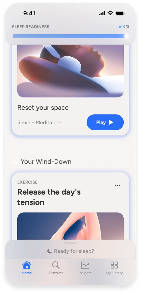
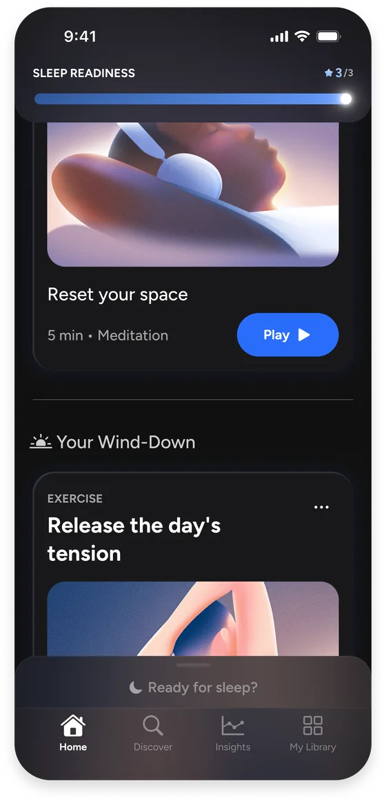
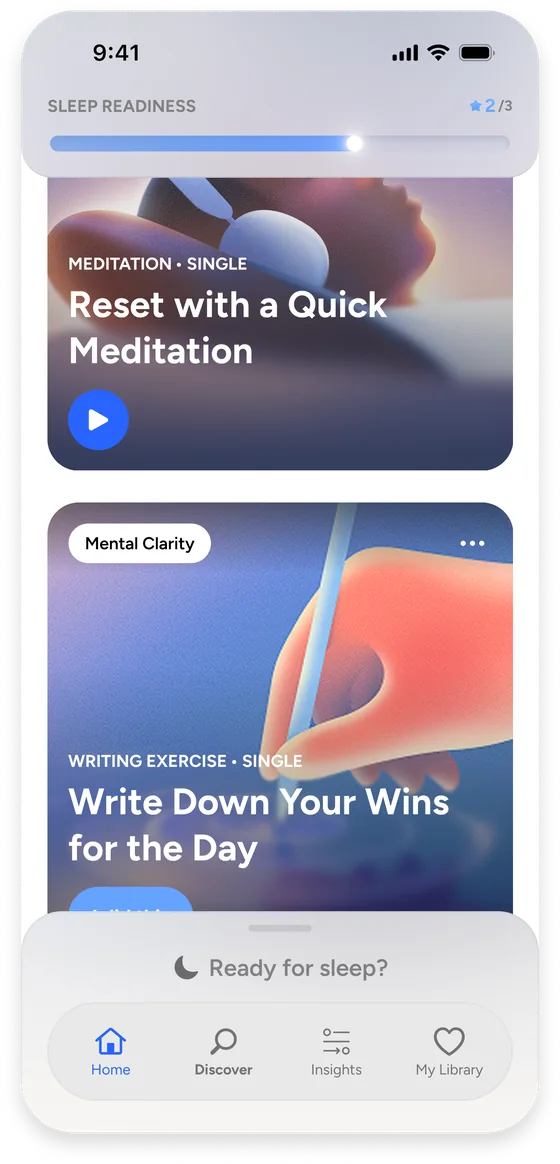
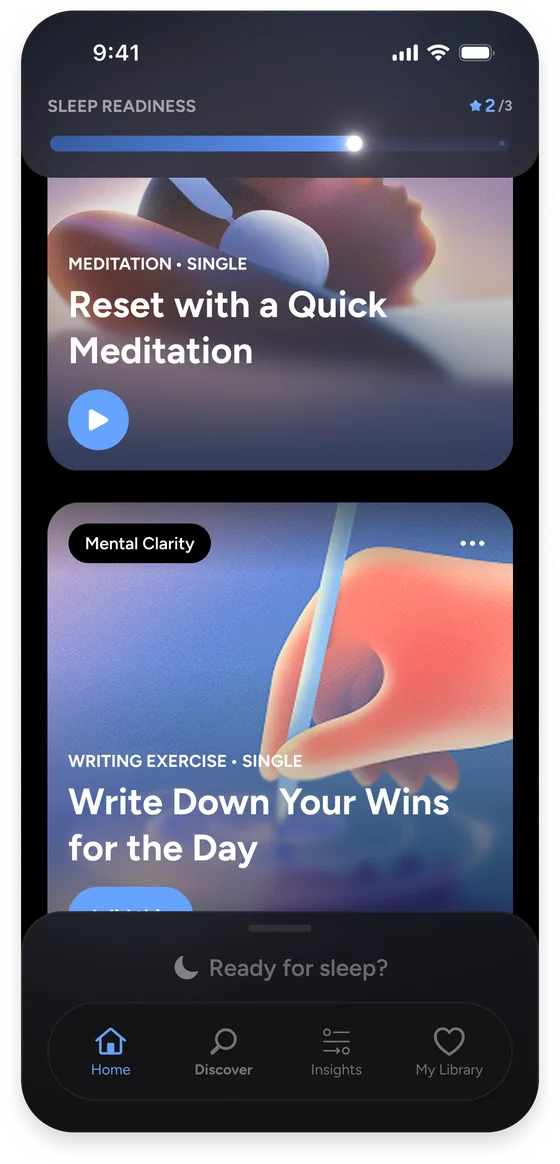
Drag to compare the plan at launch with the plan after the Content Hero Card replaced it. Same data, same slot; a component swap, not a redesign. Light and dark, both from the system.
From leadership passing to Calm Health adopting. Drag or use the arrows.
Pushback. Contrast could not be guaranteed over artwork that changes every session, so the MVP kept text off the image. I pushed for full-bleed cards and engineering built a scrim that adapts to the image at runtime. It went back into the foundation, so every product on the system inherited it.
Buy-in was thin where I needed it most and strong where I had not expected it. I took the system to other teams directly. Calm Health, on the Enterprise side, adopted it while their product was still being built and met with me weekly for three to four months to learn it and push it further. I built Health's brand tier with them, ten overrides on the accent family and nothing else, and taught the mechanics: aliasing, how modes resolve against a component, how to build component properties so collection theming holds. They left able to extend it without me. They never pushed back on the system itself; they embraced the working relationship. The one worry they voiced was about time, not structure: with AI moving as fast as it was, would what I was teaching still hold a year on, and would the way we were structuring things still be the right way. It is a fair question for any system built in 2025, and the answer I gave is the one this page makes: tiers, named intent and tokens that carry their own rules are what an agent can read, which makes them more durable as AI advances, not less. Their product had not shipped when I left, so this page shows the brand file rather than screens.
What Health pushed back on. Nothing in the system. The one worry they voiced was about time: whether what I was teaching would still be the right structure a year on, with AI moving as fast as it was. The answer is the one this page makes, that tiers and named intent are what an agent can read, so they age well.
Classic was captured, not migrated. With engineering I encoded Calm Classic's primitives, semantics and brand into the foundation, so its twelve years of UI resolved from the same tokens, dark mode included. Moving Classic's screens onto the new components was never prioritized by DTC. The system holds Classic; the product still runs its old code.
Twice. At Calm, Claude drafted the token structure and naming conventions and I set the boundaries: what belongs in a primitive, what is a semantic, what only a brand may know. Then I showed Health's team the same loop, feeding the token structure and a component into Claude and getting screens back already speaking the system's language.
And again for this page, as a test. In October 2026 I had Claude, working through Figma's MCP, rebuild the system from my token export and 290 shipped screens, 103 from Sleep and 187 from Classic, without access to the Foundation file: three collections in my naming, every component fill and stroke bound to a semantic, a composed screen flipped across the brand modes. Then I compared it to the Foundation tokens. The shipped accent sampled at #2b6cfa against blue-600 #2a6dfa; the tier structure, the ten brand overrides and the semantic set matched; the reconstruction missed the Health purples and the elevation ladder, which only the file had. The method is the same one the system was built with: AI drafts, I decide, the product confirms.
# Collections, in Eric's names
Primitives   one mode       color/gray/0 … color/gray/1000, blue/600, space/1 … space/24, size/100 … size/900
Brand        five modes     accent/light, accent/dark, accent/on-light … accent/secondary-dark  (ten variables, nothing else)
Semantic     Light, Dark    surface/bg, surface/surface, text/fg, text/muted, border/border, accent/accent → Brand

# Rules
- Every fill and stroke on a component binds to a Semantic variable. No hex in a component.
- The Brand tier answers only for the accent family. A new vertical is ten overrides.
- Verify against the shipped screens before publishing a value.

# Result
69 primitives · 10 brand · 21 semantic · 24 text styles · 6 components, 17 variants · 1 screen, 4 brands, 2 modes
Deep design systems craft paired with real fluency in AI-to-code workflows. It's not common to find in one person.
Spencer S., Lead Product Designer, Calm Health
Calm Sleep, from concept to global iOS, built entirely on the foundation; Android about six weeks later from the same system. Covered by Fast Company and TechCrunch.
Calm Health chose the system for a product still in build and met weekly for three to four months to extend it, then ran the token export to code themselves.
Built for Sleep's full-bleed cards, returned to Foundation, inherited by every product on it. Toggle it and read the ratio.
Sleep shipped. Health in build. Parenting and Fitness proven with placeholder accents. Each brand is ten overrides on the accent family; tap to cycle.
Fifteen interaction states resolved by the system instead of rebuilt per component. Tap a state to see the token that supplies it.
Its primitives, semantics and brand live in Foundation: a ten-line brand file. Moving its screens onto the system was never prioritized by DTC.
DTC saw the system as a distraction from shipping speed. Calm Sleep proved the opposite. I should have made that case in DTC's terms, with the Sleep timeline as the evidence, before they passed rather than after.
Disabled states resolve at 40% opacity instead of carrying their own value. It halved the accent group and breaks inside a dimmed container. Next time I'd spend the tokens.
Calm's first new product in twelve years, built in four months on a system built alongside it. It met its launch targets. It also proved that craft and speed are not the constraint: a modern, well-built product for an audience you know will come can still cannibalize the main app and lose users' trust if it asks them to pay again for content they already had. The product was right; the premise was set before design was in the room.
Eric became my design partner right away. Together we turned product requirements into fully fleshed-out concepts, shipping the product within months of his start. When I moved off the team, Eric took over Calm Sleep.
A real plan with history, so people could see what they had done and where it was going. What shipped was tonight only; the progressive player on this page is that trade-off being paid back.
A content model that made sense. Calm's library mixed titles with subtitles and playlists with albums, and I wanted it fixed before this app inherited it. It inherited it.
Differentiation. Design pushed, repeatedly, for features Classic did not have rather than Classic's content in the shape of a plan. The plan shipped.
My case: people do not mind questions when the app is visibly learning from them, as long as the plan shows why each was asked and the answers can be changed in settings. Product disagreed and none of it shipped.
After launch, when the numbers turned, product came back and asked how we would change onboarding to give users control.
The team was asked to move faster each quarter on a component library with no documentation and no token architecture. I built Foundation while shipping this product.
When the VP left midway, with less support than before and the pace still rising, I kept building it, consulting the enterprise designers for feedback.
Two iOS and two Android engineers had the system before the screens existed and built the app from the Figma file and the system file; they came to me for interaction questions and I ran QA on the builds.
The PM wrote copy straight into system components. The lead researcher assembled her own test screens and brought me in only for what exceeded her reach in Figma. The lead and the staff designer worked from it daily.
Marketing came to design for the outward-facing material: the App Store visuals for both apps, and the launch and release imagery on this page.
The studio team's motion designer built Breathe Bubbles and the check-in from the motion curves and the screens; UXR ran the two testing rounds on my prototypes and the smaller tests between them.
Calm's first new product in twelve years launched on iOS in four months, with a 4.7 rating and install-to-paid above target in both markets.
Engagement and conversion measured in the first weeks after the September 2025 launch, against the targets set before it.
The targets were met. Then the numbers turned, for the two reasons design had argued about before launch: users found they had no control over their plan, and recognized the content as Classic's. The app did not differentiate itself enough, and the main app lost users to it.
Calm Sleep had good content and no way in. Browsing assumes you know what you need, which at 11pm nobody does. The plan is a curated set of tasks tied to each user's onboarding answers, with a Sleep Readiness score that makes progress visible. Every item maps to one of nine scientific foundations, so personalization is grounded in sleep science, not preference.
Tap one: what it is, the onboarding answer that feeds it, and the kind of plan item it produces. The plan is a set of foundations with a schedule, not a library.

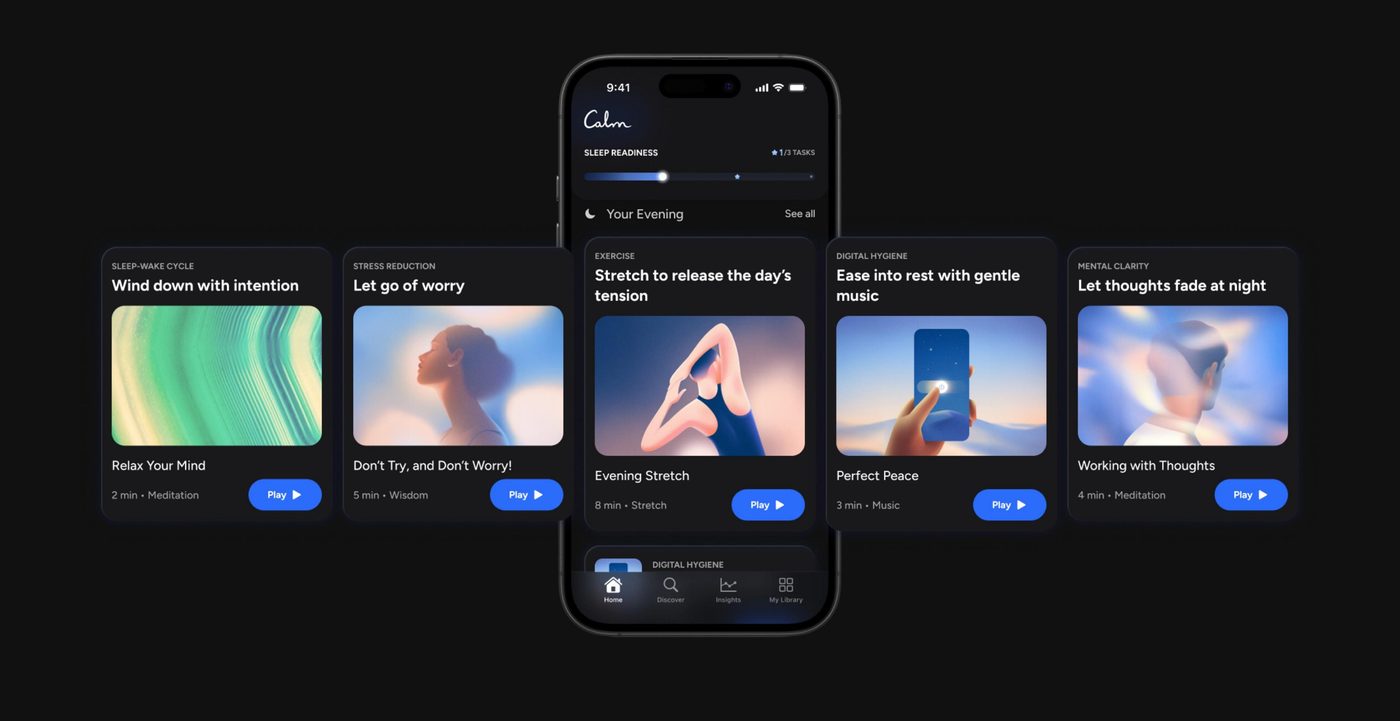
From the splash to the plan. The order was the argument: promise, proof, six questions that each map to a lever, a visible wait, the schedule, then the account. Use the arrows or the keys.
SOS skips the plan. A screen recording from the shipped app: the sheet, the carousel, the swipe to play, and the way back. The notes follow the recording.
I heavily rely on that SOS sheet. I have trouble selecting what's best for me at night. I wake up in the middle of the night and it helps so much.
Research participant, UXR usability test
Play a loop: the micro loop runs every night, the macro loop every week, and SOS is the branch for 3am. The check-in is where the two meet.
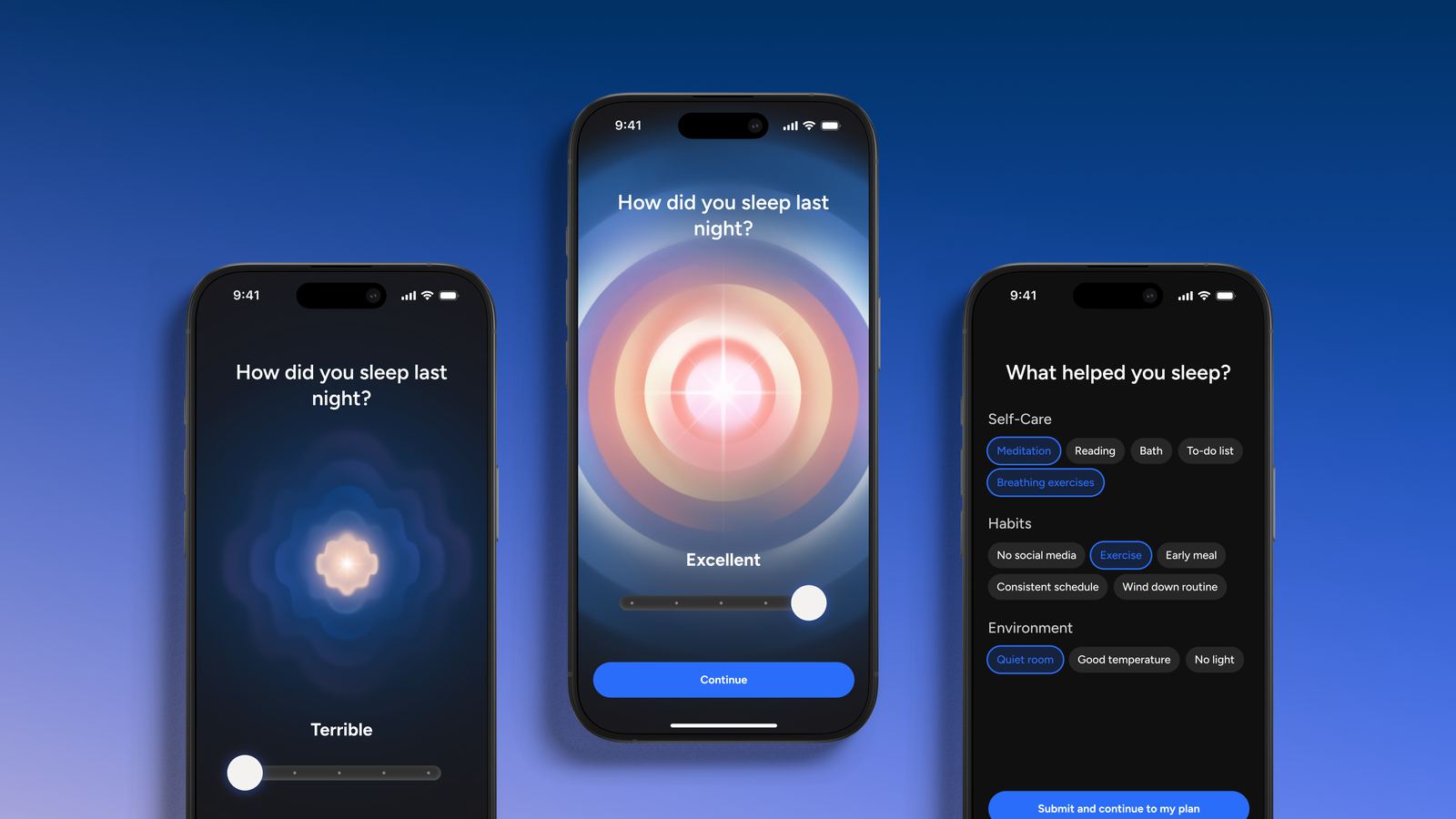
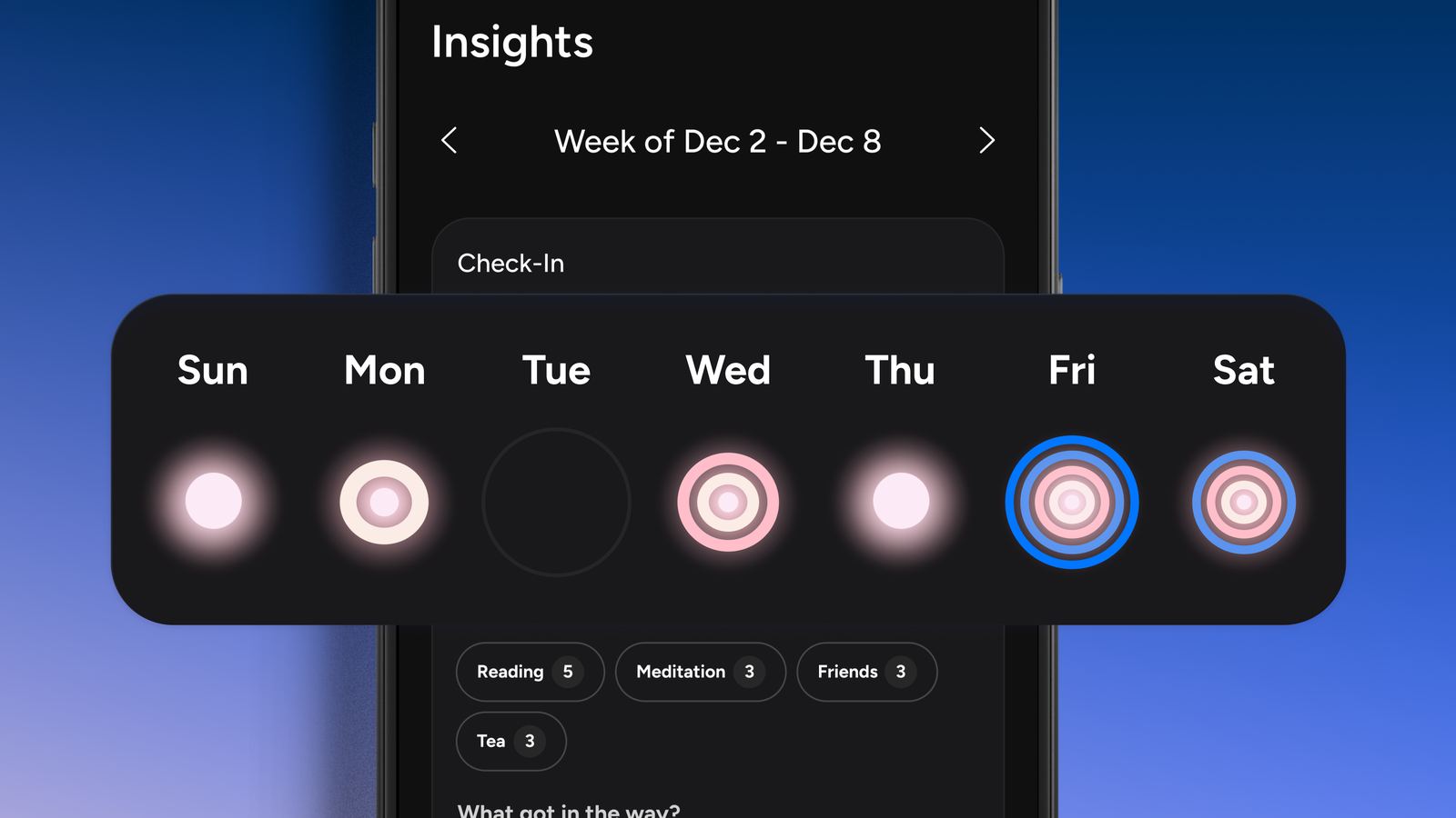
Early testing showed users understood what the plan was for but not how it worked. What counted toward Sleep Readiness was not clear. The tempting move was more personalization. I prioritized making the scoring immediately legible, because tuning a system users do not trust yet only compounds the problem. The first round, moderated sessions on the mid-fidelity prototype, returned three things to fix: make the plan mechanics immediately clear, reduce the cognitive load so the screen reads as a plan rather than a checklist, and personalize the activities to the sleep problems people named.
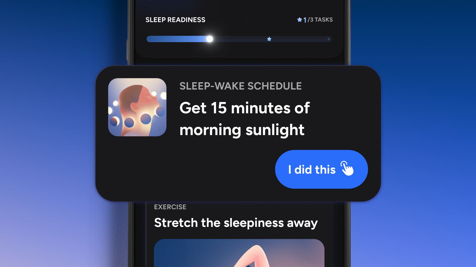
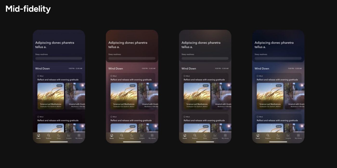
Users described the tasks as short and manageable, but the screen still read as a checklist. The fix was not fewer or shorter tasks. It was tightening the surface itself: the difference between "here is your plan" and "here is everything you could do." The second round confirmed the plan was understood and the tasks felt short and manageable, with consistency still hard on busy days. Two asks came out of it: clearer guideposts on what matters most, and the right balance of repetition and variety.
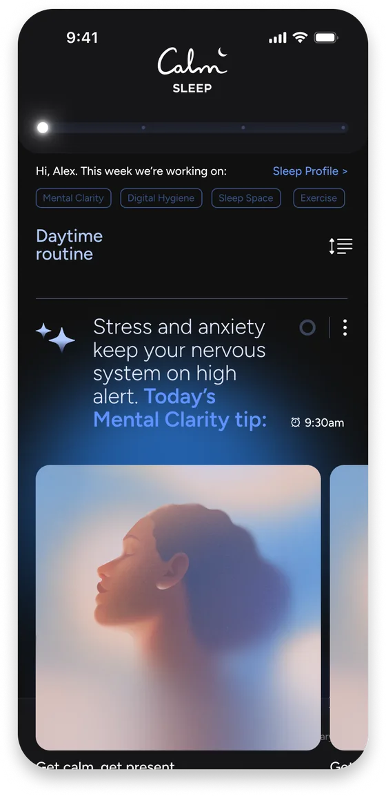
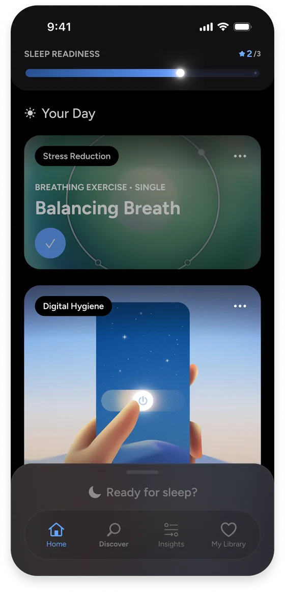
Pushback. Testing reshaped priorities twice before launch. The second instance was the ask for guideposts: it became the ordering of the plan, the item on the strongest foundation first, with the readiness milestones saying why. I argued against adding a difficulty label per item and won; the label would have reintroduced the checklist feel the round had just removed.
The progressive player. A guided, sequential content experience aimed at the two drop-off points in the data: tonight's items queued in order, the week visible above. Explored and tested, never shipped. It is the version I would build next.
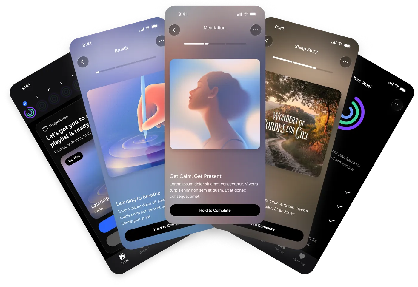
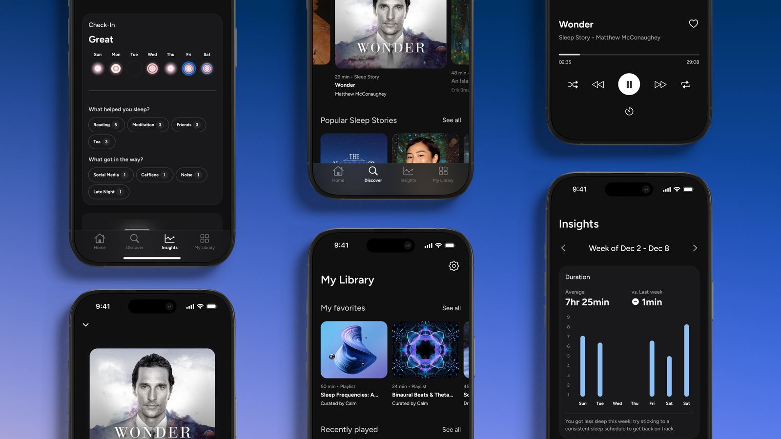
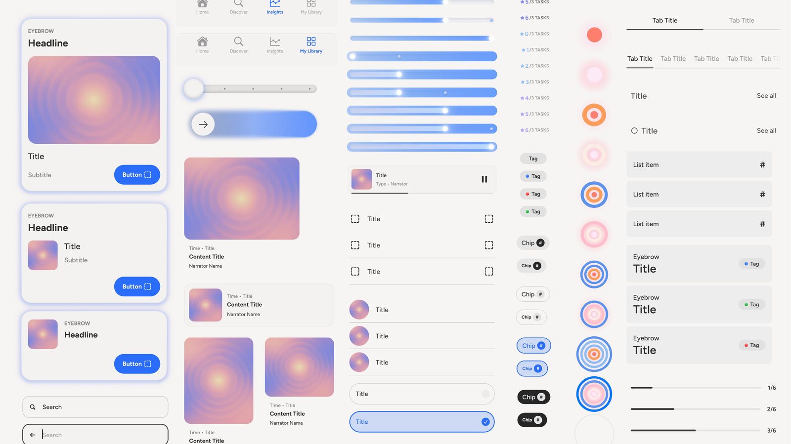
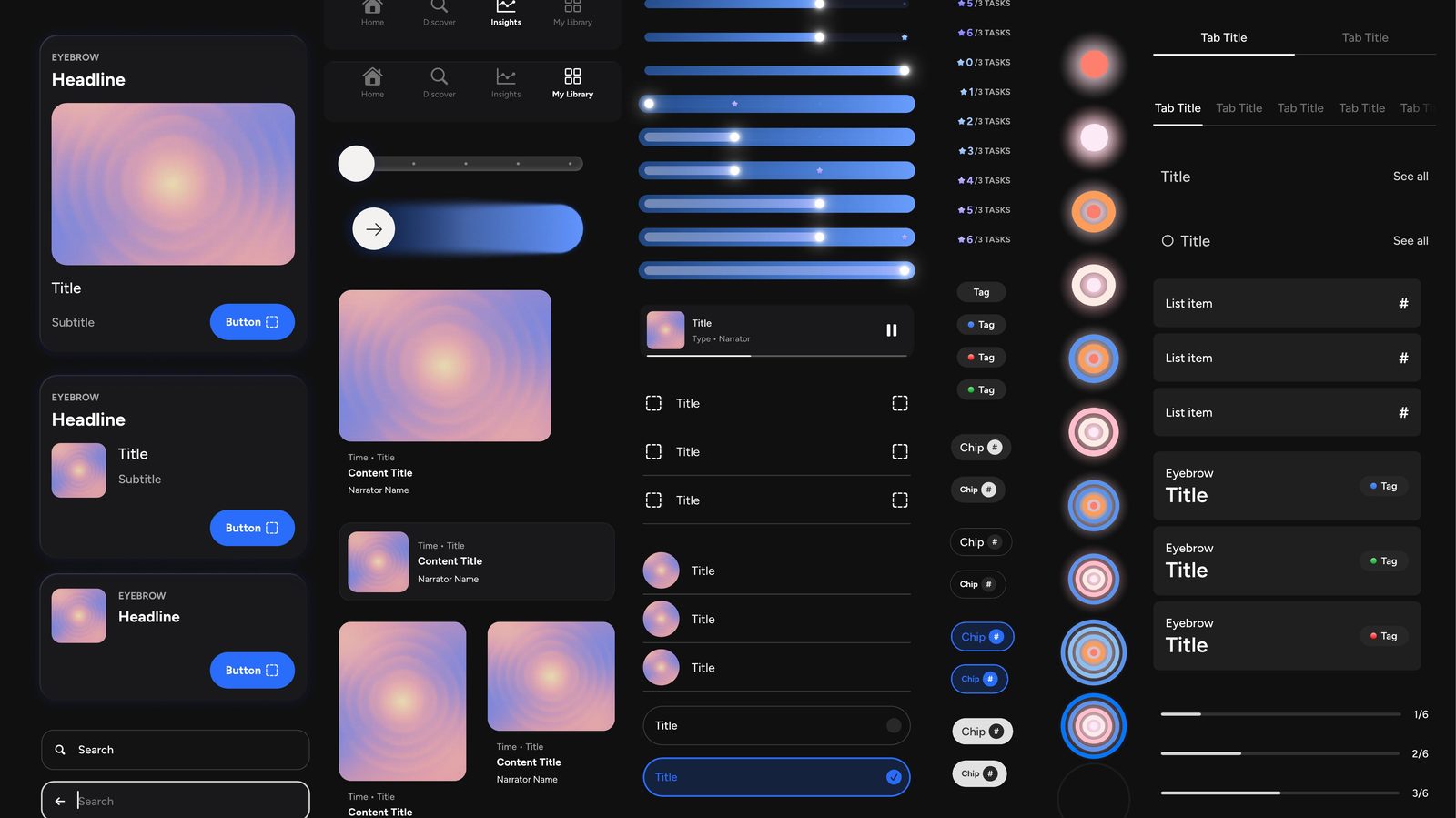
This page has no generative AI in it, and says so. The personalization is designed logic: onboarding answers flag foundations; each foundation owns a pool of plan items; a day's plan is three items drawn across the flagged foundations, with the sleep-wake schedule as the anchor. Sleep Readiness is a count, three of three, resolved by rules I could explain on a whiteboard, not a model. I owned the mapping and the item taxonomy; engineering owned the engine. For a reader at an AI company the point is the sequence: legibility, then trust, then personalization. The same sequence applies to any system that adapts to a person.
The measurement plan, set before launch: four questions, each with the signals that would answer it. The results below are these signals read after the September launch.
Calm's first new product in over a decade, concept to global iOS in four months.
Install-to-paid came in 34% above target in the US and 14% above in Australia.
5-plus day engagement reached 15.2%, from a start where 73 to 74% never returned after day one.
31% more users engaged with a plan item, with 8% higher completion.
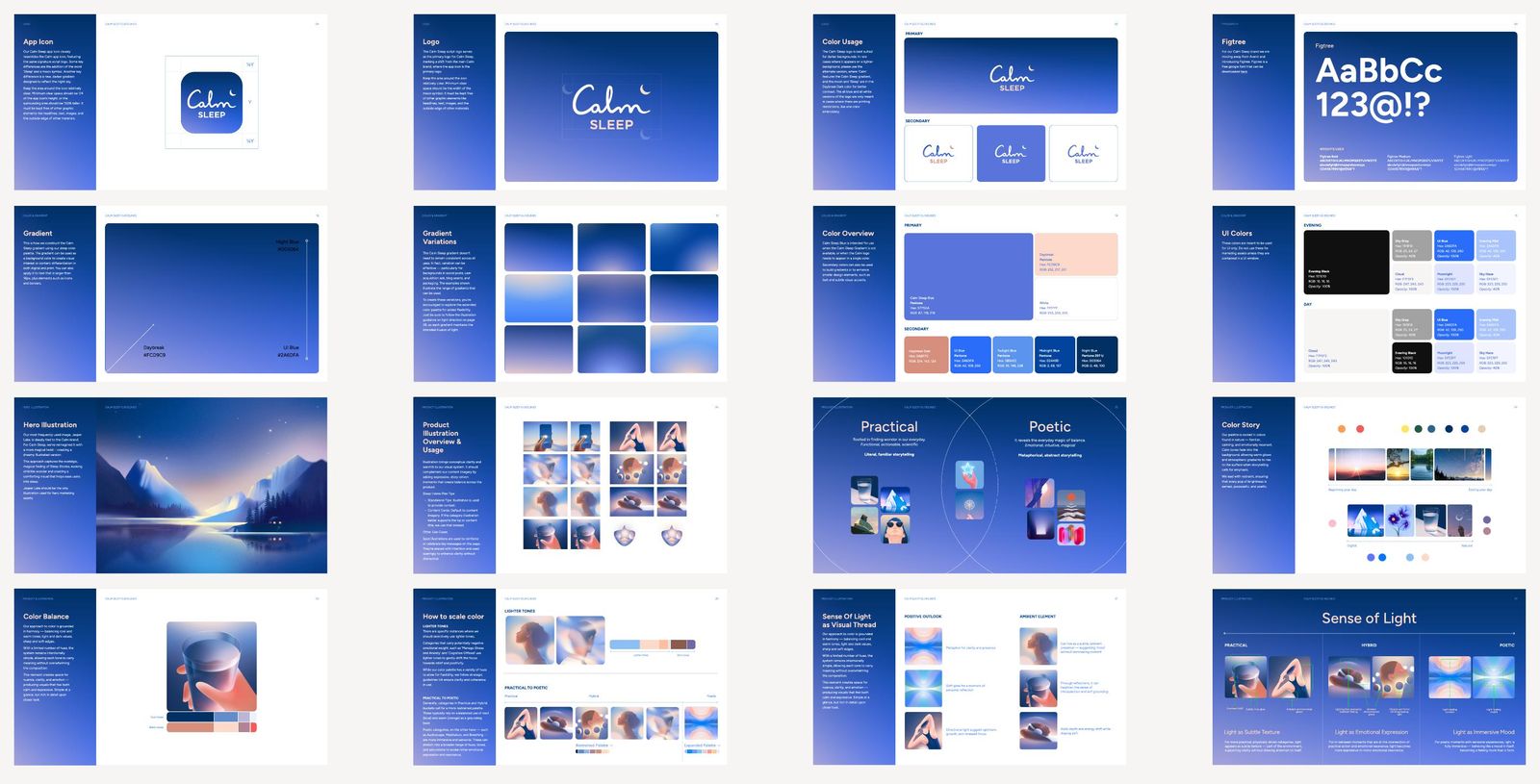
Figtree in place of Avenir, a palette from Evening Black to Moonlight, Jasper Lake reimagined as the hero illustration, and the Breathe Bubbles and check-in animations, designed in Rive and rebuilt in Swift to ship.
The app shipped on both platforms. The one piece that stayed in exploration was the progressive player, the plan as a playlist, prototyped against the two drop-offs in the data.
The premise. A second app for sleep cannibalized the main app and confused users about why they needed two, and that was said from day one. With what I know now I would not have built a second app. I would have built the sleep experience into Classic, fixed its content model so the library reads as a story rather than a catalog, and turned Classic from a library into a mission-driven, segmented program that changes with you, measuring whether the content is helping with the goals people set. The second lesson still holds: legibility first, then trust, then personalization.
The MVP shipped with Rive animations driving the home surface, and on device in SwiftUI they did not hold up. Post-MVP we pulled the Rive runtime and rebuilt the animations in Swift, with less motion on Home and clearer hierarchy. Motion has to be tested on a real device early, not at the end.
The progressive player, prototyped. It aims at the two drop-offs in the data: the decision at the top of the night, and the return to Home between items. Explored and tested before I left; not shipped.
CreditHub: one Experian tab answering the three questions people actually came with, shipped in three tested phases across web, iOS and Android. It proved that pace is a design decision. Twenty-one months, each phase tested before the next was built, nobody burned out, and the tab still runs today as it did the day I left. Not flashy and not AI-driven; it answered exactly what people came to ask, and it held.
It was the one thing that slowed the work. Rather than wait on it, I built most of CreditHub's components myself, sat in the systems team's meetings, and argued for them to become slot components so other teams could use what we built.
This is where the conviction behind Foundation comes from: how fast a team can move is set by its system, and I watched it set ours.
It is tappable with no sign that it is, and clunky in use. For a long stretch it was also a different widget from the one on the dashboard, because the dashboard could not be changed until it was rebuilt, so the two sat mismatched. We were aligned with engineering on the timing; I still did not like it, and I still do not.
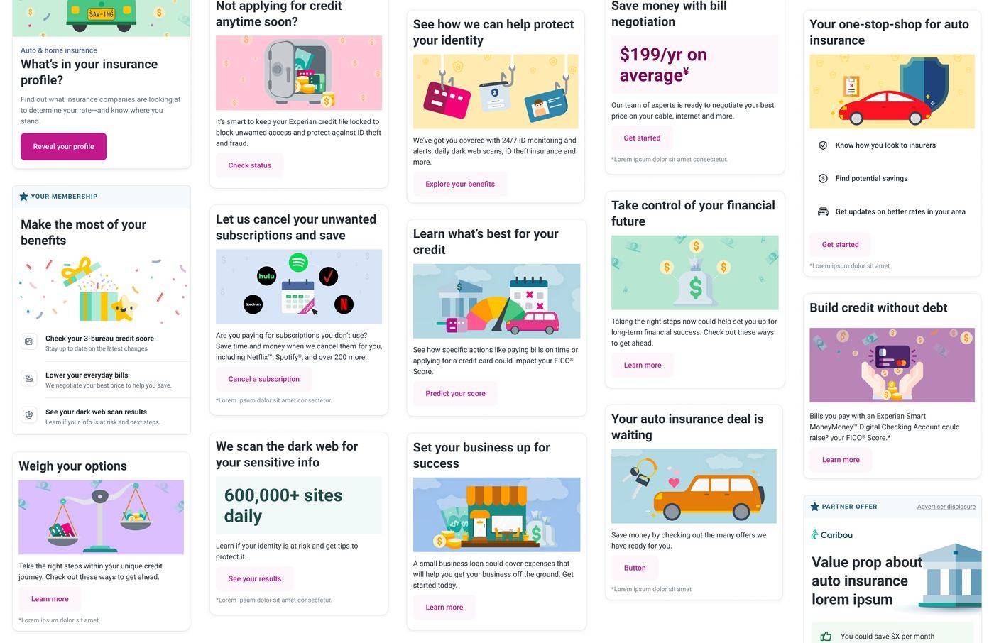
The system under construction did not have what CreditHub needed, so I built most of the components myself: the score card and its states, the switcher, Key Factors, Score Ingredients, the debt summary, the quick actions, the marketplace card. Then I made the case to the systems team that these should not stay credit-specific, and got their buy-in to rework them as slot components, a fixed frame with regions other teams could fill with their own content. That is what let the marketplace run a dozen offers off one template, and it is where the conviction behind Foundation comes from: how fast a team can move is set by its system.
Four engineers built web, iOS and Android from the files. Two UX writers wrote into the component structure, inside the licensed-language constraints. The lead researcher ran the rounds on my prototypes. And the components designed for the credit tab went into the global system for other teams to use.
Task success rose on every tested task. Free-to-paid conversion rose 5.25% and paid churn fell from 7% to 5% in the first month after launch.
Usability task success before and after CreditHub. Hover a task for the numbers and the test.
Moderated with UXR, at least 25 to 30 participants per round, one round after each phase.
Users' three questions were answered in two places. Linking Reports and Scores would have been the easier fix. I consolidated the content into one Credit tab, organized around the questions users asked rather than how the data was stored, and kept the full report one tap away.
The same ten pieces of content. On the left, where the data lived: two sections, split by source. Switch, and they re-sort into the three questions people came with: what is my score, what affects it, what do I do next. Nothing is removed; everything moves.
A paid user with one question: why is my score what it is. Before, the answer lived in two sections and the trip ran through the Help Center and, for one participant, his photo app. After, it is one tab. Tap a step for what they said; switch to see the same question answered after CreditHub.
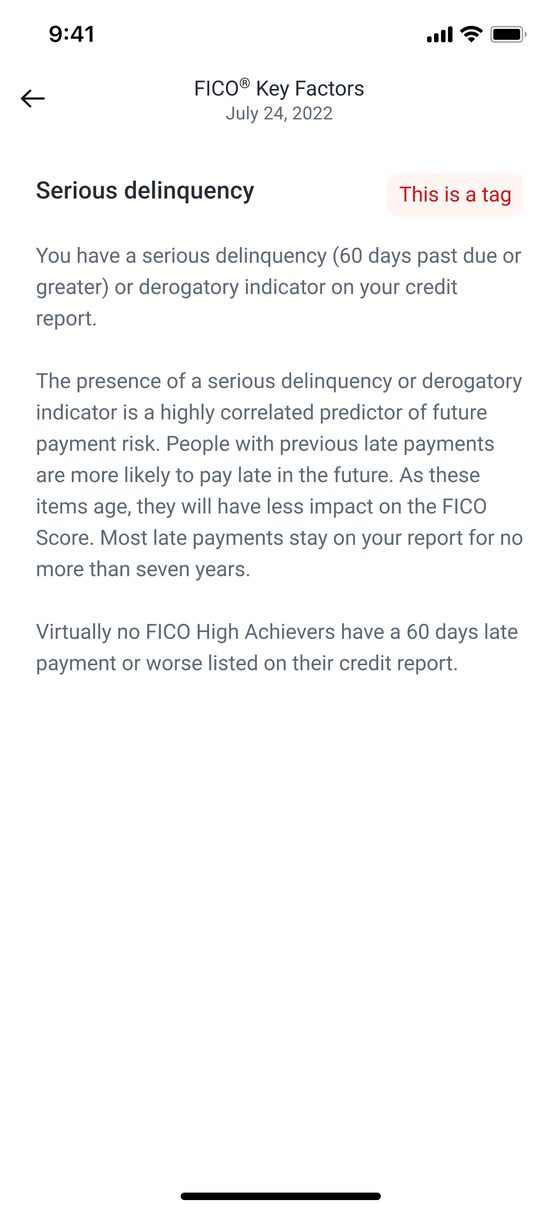
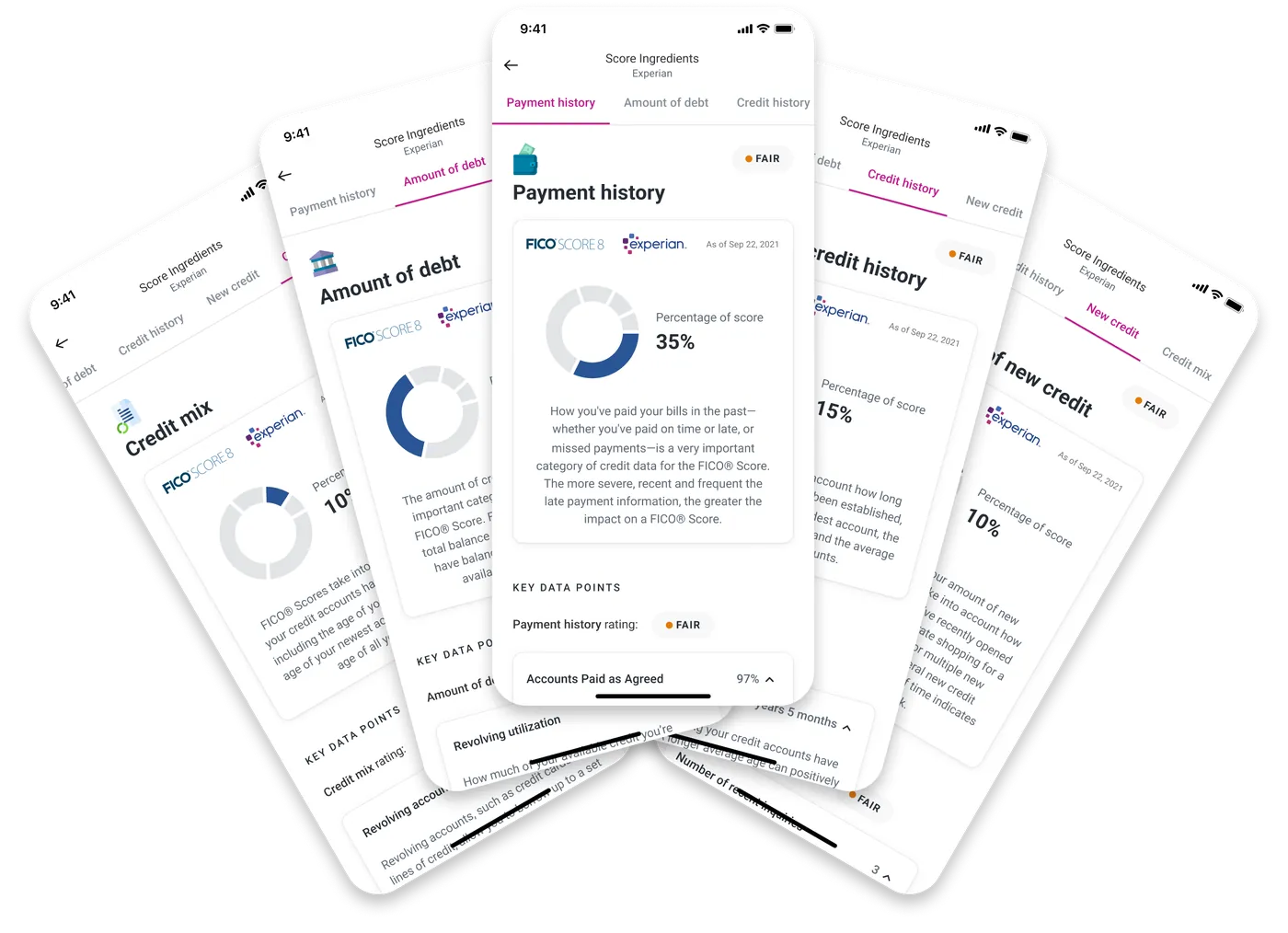
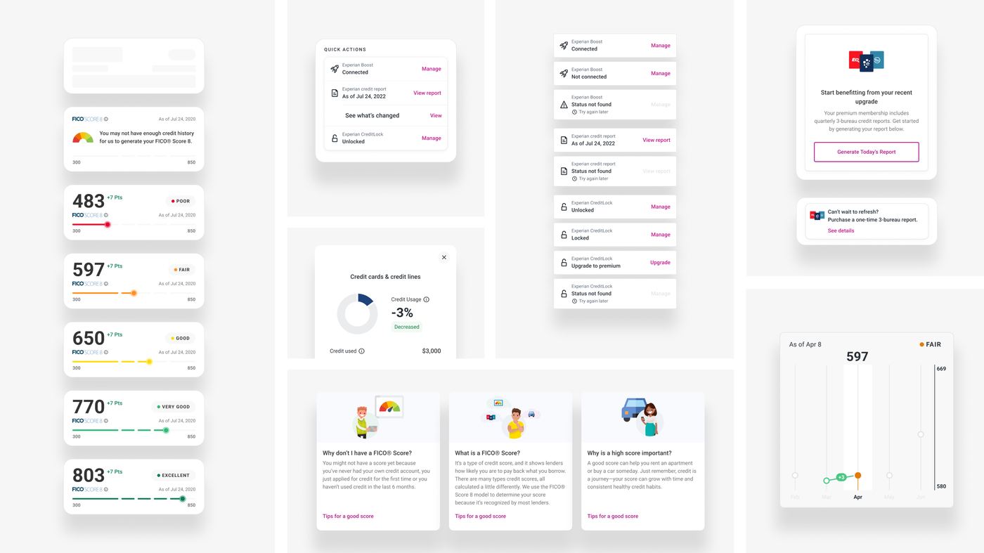
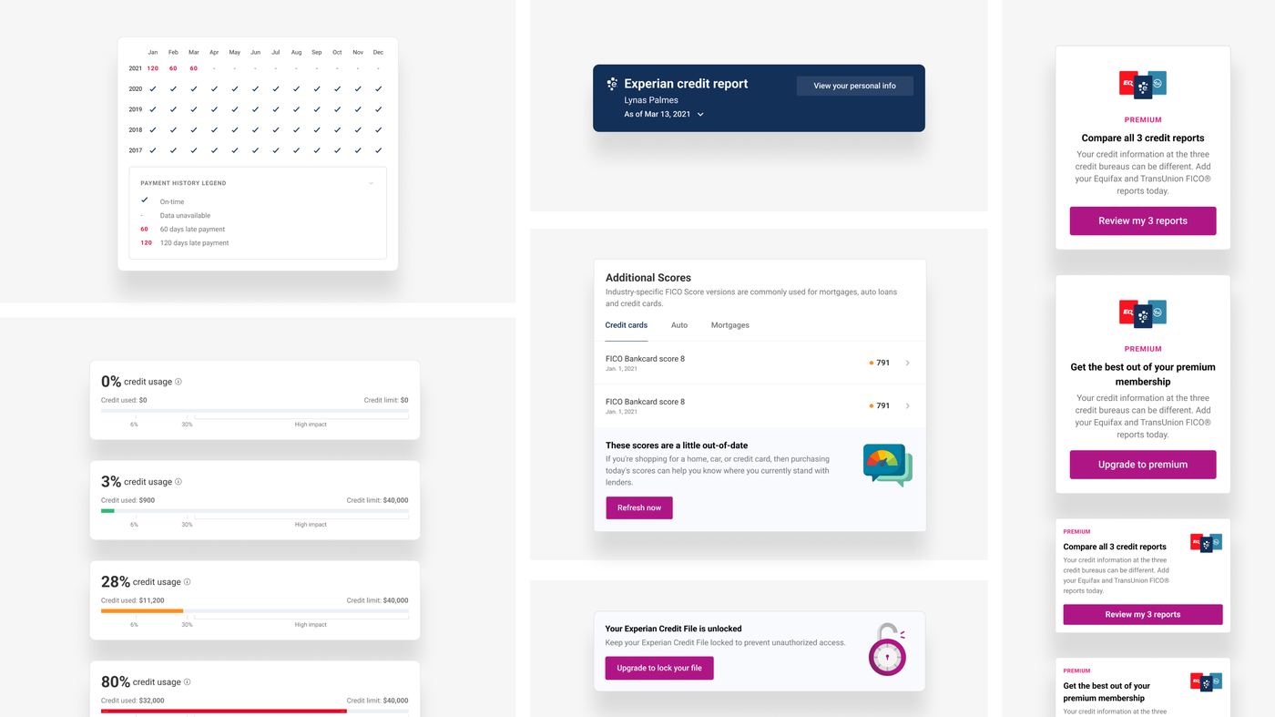
Users needed to compare Experian, Equifax and TransUnion, and the old experience made each one a separate trip. A sticky bureau switcher lets them compare without leaving the view. Comparing went from 19% to 89% task success, and users named it one of the most valuable parts of the redesign.
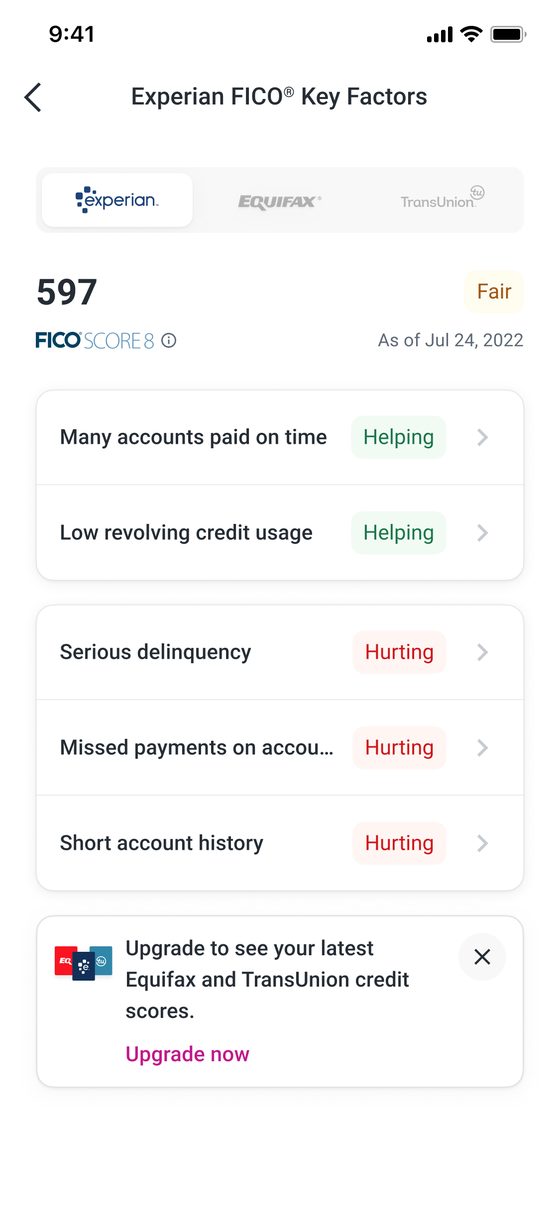
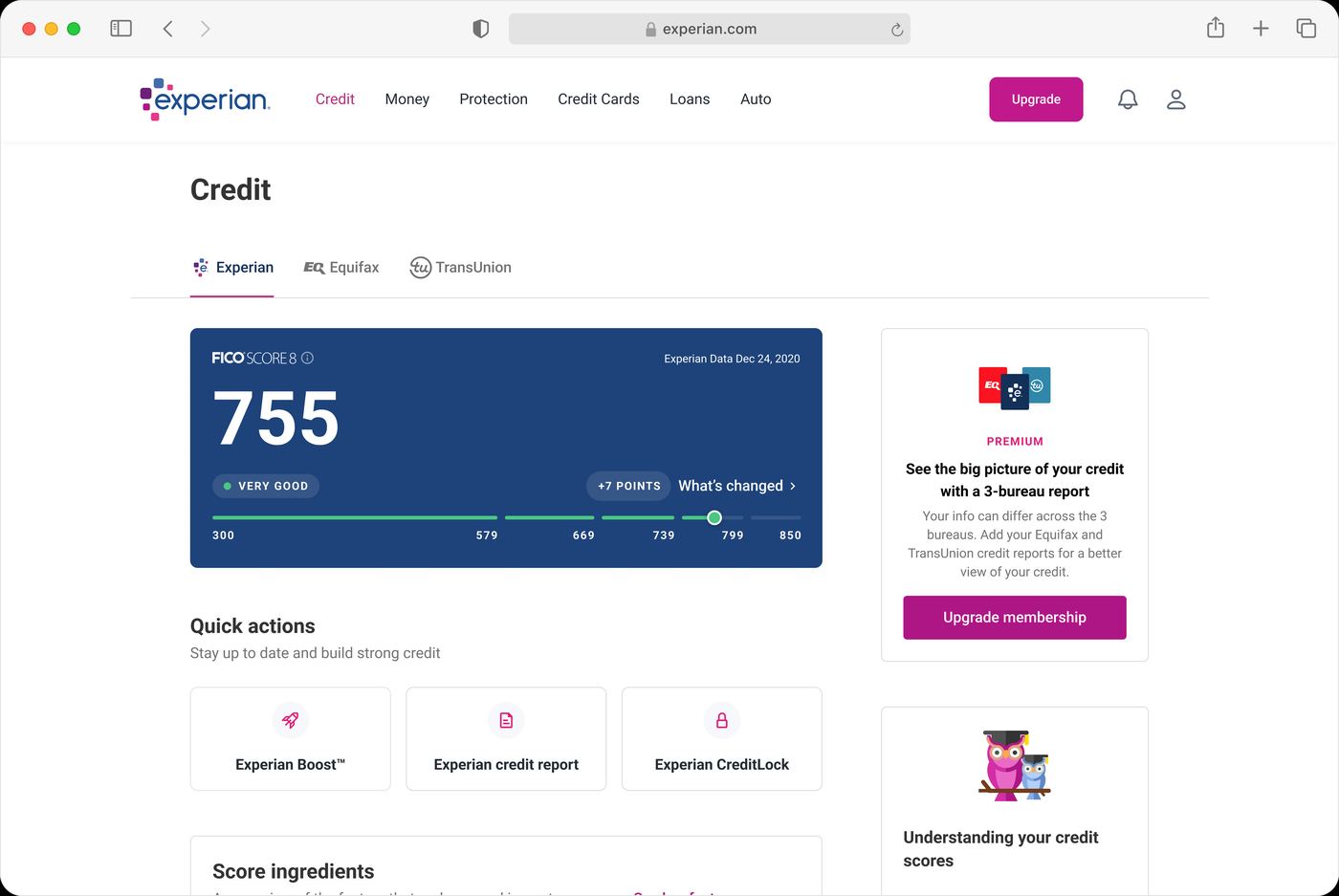
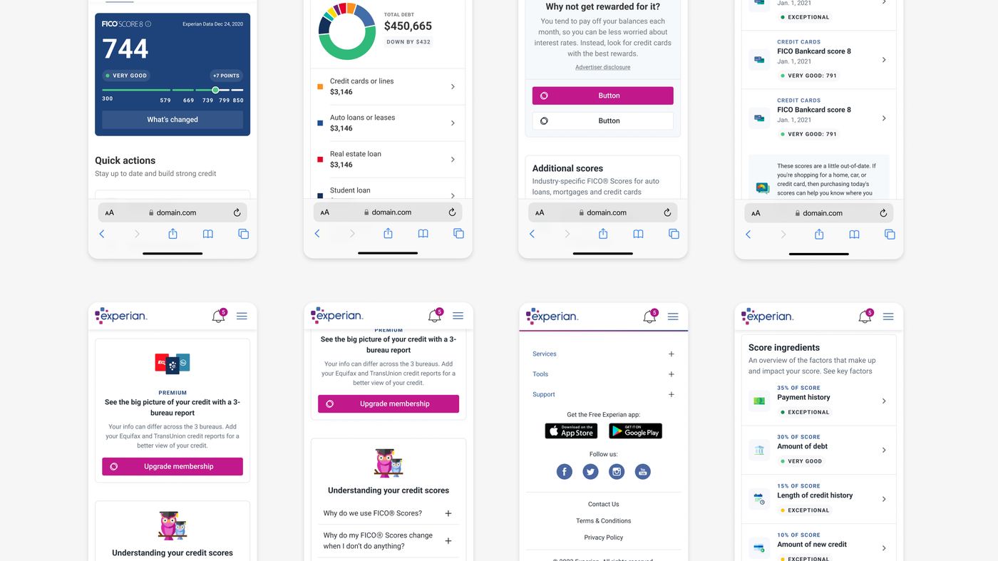
I broke the MVP into three phases with product and engineering, sequenced by how each section relates to the others and by effort. The score came first because everything else explains it or acts on it. Each release went through usability testing before the next, so feedback shaped the product while it was still being built.
Each phase tested before the next was designed. Drag or use the arrows.
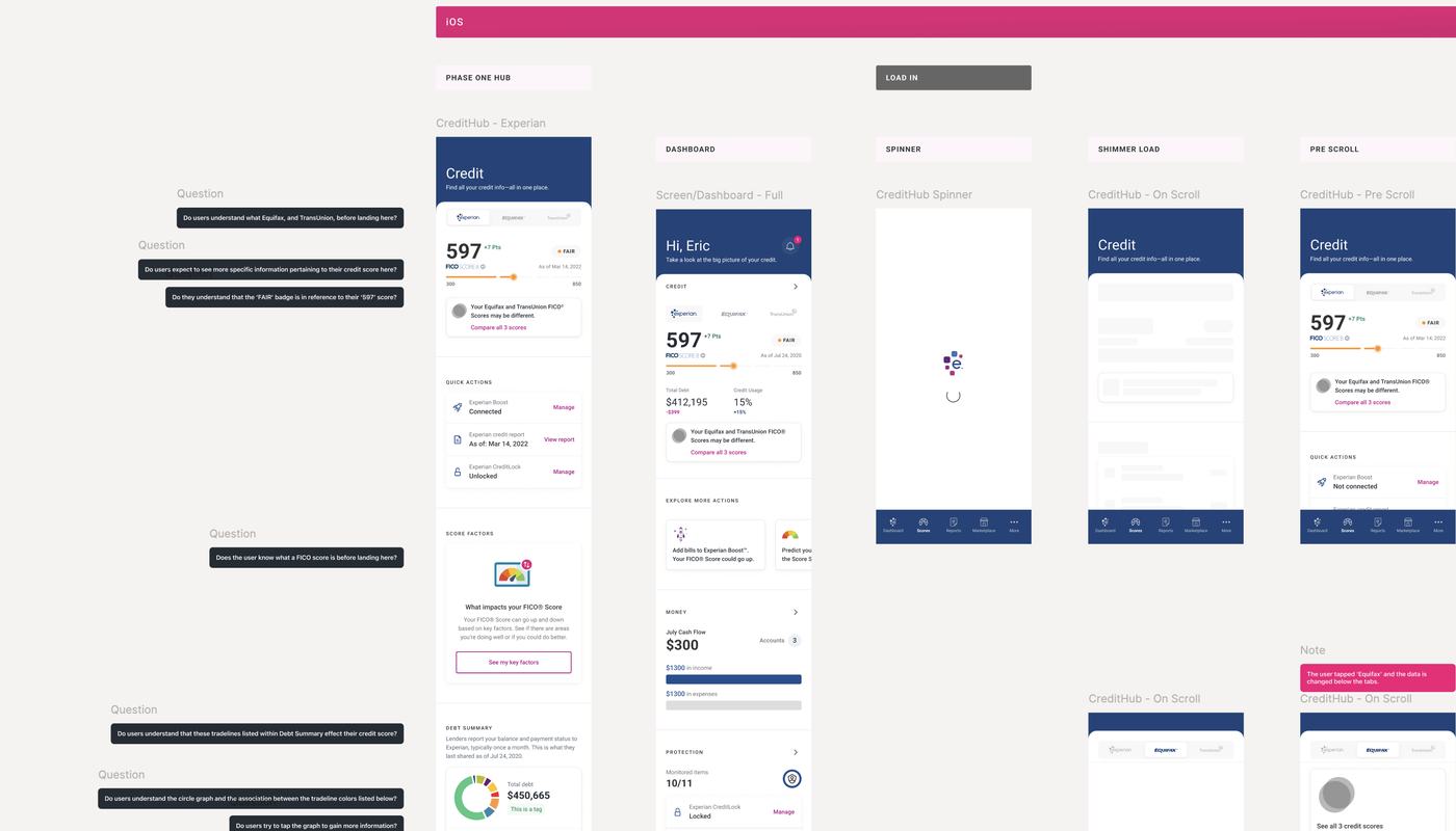
Pushback. I pushed for contextual education in the MVP and lost to scope: product held the MVP to the three questions and the education came after. So I built the IA to accept it later. Industry-specific FICO scores stayed at 55% success when every other task cleared 70%.
Contextual education, in the MVP. An education slot: a prompt, a two-line answer, one link deeper, placed inside the section that raised the question. Designed, argued for, cut from the MVP; the IA held the slot. After launch I built it: an educational carousel of the questions new members ask, and an education screen, Tips for a good score. Two more, discussed and never built: a settings experience that let users control what CreditHub showed them; and richer infographics for the content, which the rules on how score information may be represented did not allow.
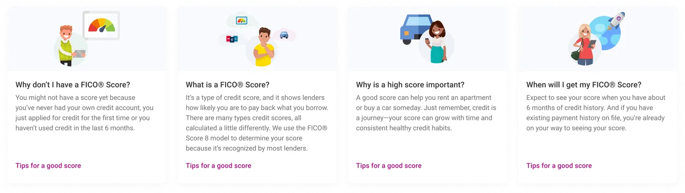
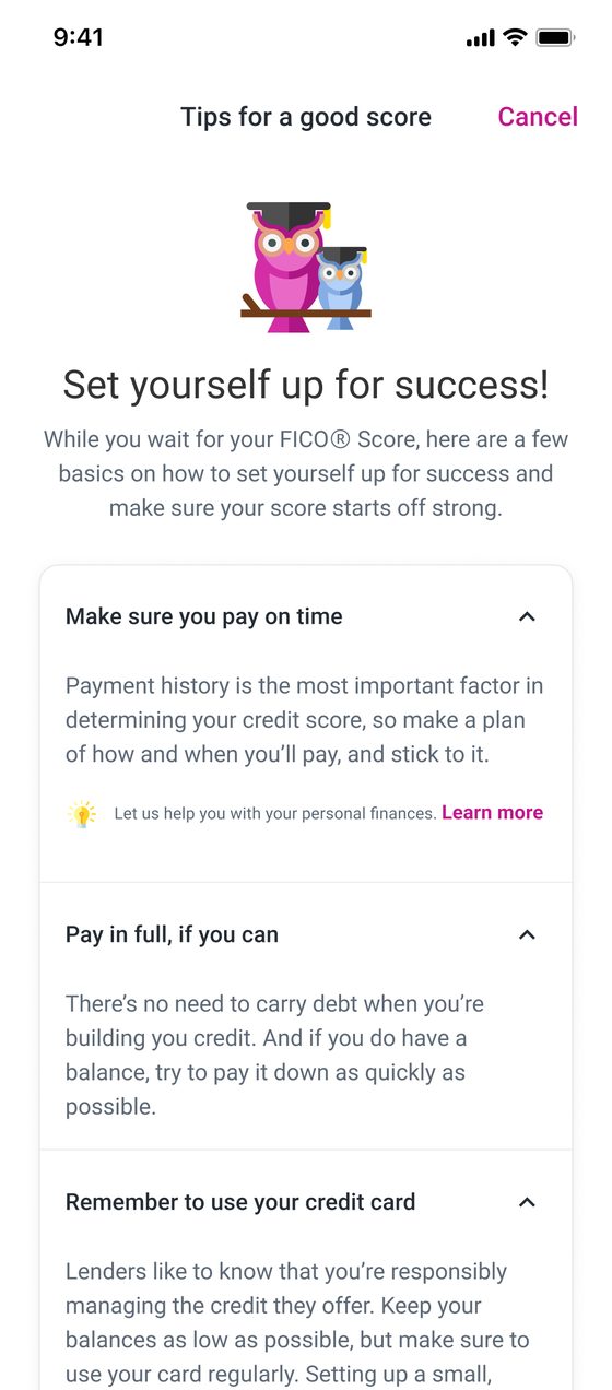
None. This work predates the pipeline, and the page says so in one line rather than retrofitting a story. What carries forward is the method: test between every release, and sequence by what explains what.
I have to go to Reports to view my debt summary and then go back to Scores to access the categories of that debt. I screenshot them both on my phone and go to my photos to compare them.
Research participant, UXR usability test
Score factors from 9% to 82%. Debt and usage from 6% to 92%. Every tested task improved.
Free-to-paid conversion rose 5.25% in the first month after launch.
Paid churn fell from 7% to 5% in the first month after launch. The most reported support issue had been that people could not find why their score was what it was.
Comparing Experian, Equifax and TransUnion went from 19% to 89% task success. Users named the switcher one of the most valuable parts of the redesign.

The same credit experience on web, mobile web, iOS and Android, from one set of components.
Finding industry-specific FICO scores rose to 55%, well behind every other task.
The pace was right and I would keep it; three tested phases over twenty-one months is why the tab still stands. What I would change is the feel. Experian's product reads like paper, like documentation, and the red tape makes that hard to escape, but the system we built then was almost entirely about UX and components flexible enough for every team. The visual layer was never the focus. With that system in place, a fresh take on the surface, the kind the AI era is making normal everywhere else, would do more for the product now than any new feature.
The score widget. A tappable element should look tappable, and the tab and the dashboard should never have shown two different versions of the same number. The settings experience that let people choose what the tab showed them should have been built; it was only discussed.

I am a product designer who also ships the code. Fifteen years in, most of it untangling complex, data-heavy workflows: five leading information architecture at Experian, then AI and Personalization at Calm, where I built the design foundation the company's newest apps run on.
I run Zovie Software, where I designed, built and produced Growl alone: the design system, the SwiftUI app, the backend, and a pipeline that generated every image and narrated every step of 500 recipes. The method is what I call precision orchestration. Agents are directed, reviewed and overridden; they are not handed the keys.
I am looking for a Staff role at a company building at the frontier of AI, where design, systems and code are one job. Based in Los Angeles. hello@ericfillingame.com
You rarely find a designer who balances elite visual craft with the systematic thinking required for modern product development.
One of the most thorough systems designers I've ever worked with. He refreshed our outdated design system, brought it to parity with industry standards, and built relationships with engineering so handoffs were smoother and production matched design.
Deep design systems craft paired with real fluency in AI-to-code workflows. It's not common to find in one person.
When given an exploratory concept, he brought clarity and structure to ambiguity, end-to-end, with minimal direction.
Brett M., Designer Advocate, Figma
Colleagues complimented his approach: design thinking and a systems thinking mindset when crafting solutions.
Chad F., Sr. Product Designer, Spectrum
The products he designed often rose to the top of our sales reports.
Taylor S., Founder and CEO, FutureStitch
Earlier work: concepts, redesigns and products across mobile, web, watch and in-car. Open any project for its full set.
An infotainment system and companion app for Gem Car.


An agentic web browser that conceptualizes AGI based user interactions.


A social bill pay app with a community.
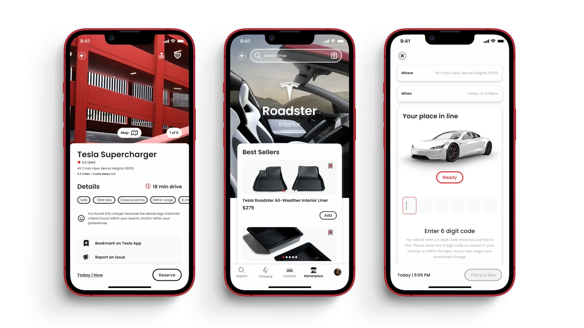
A redesign of the Tesla mobile app for reserved charging.
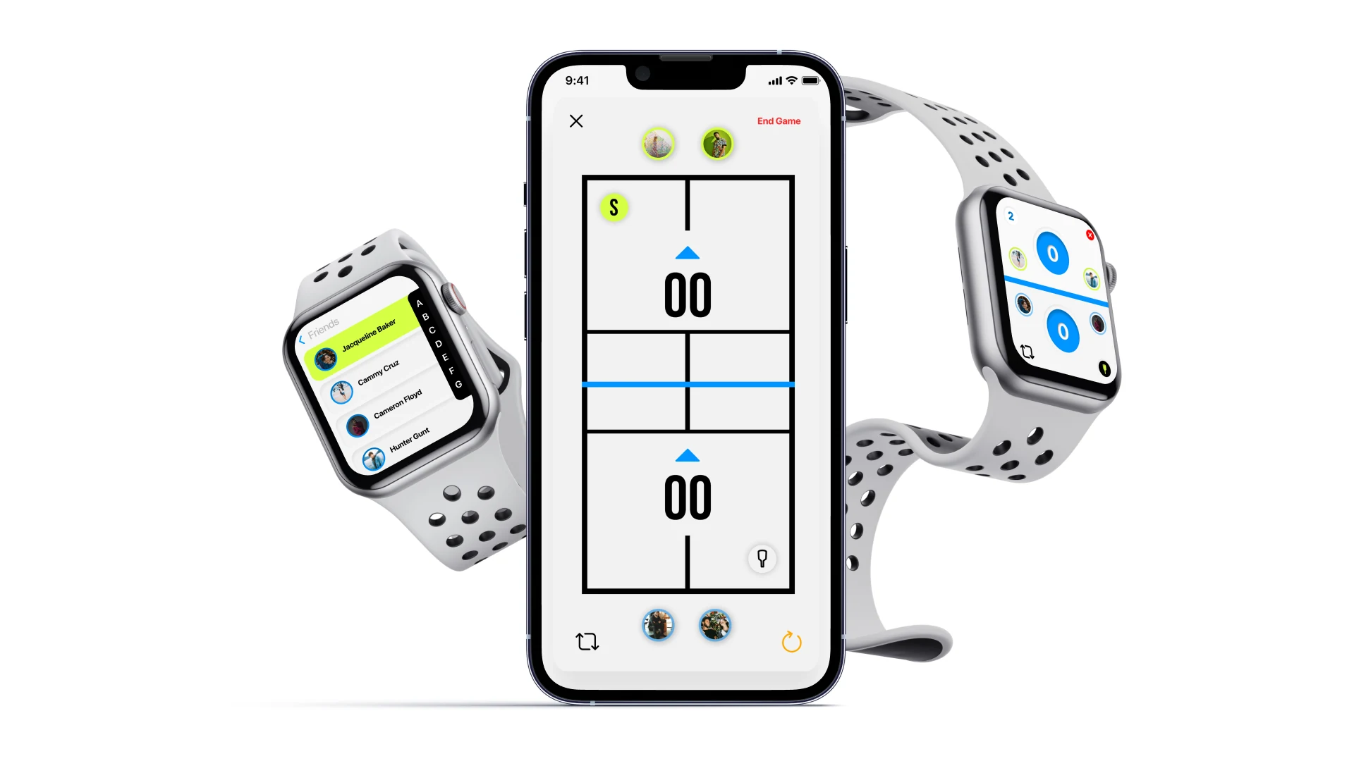
A pickleball app that helps users keep track of their score in real time.


An LLM that is brutally honest and helps users navigate echo chambers, filter bubbles, and more.
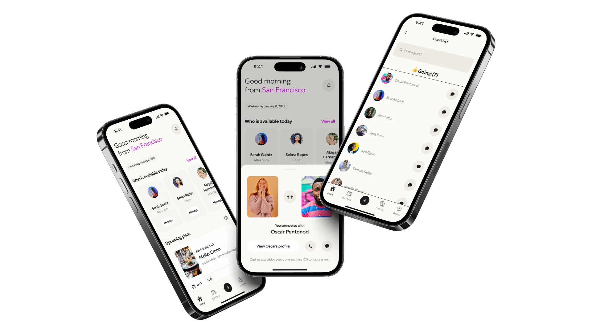
Social planning and event booking with friends.
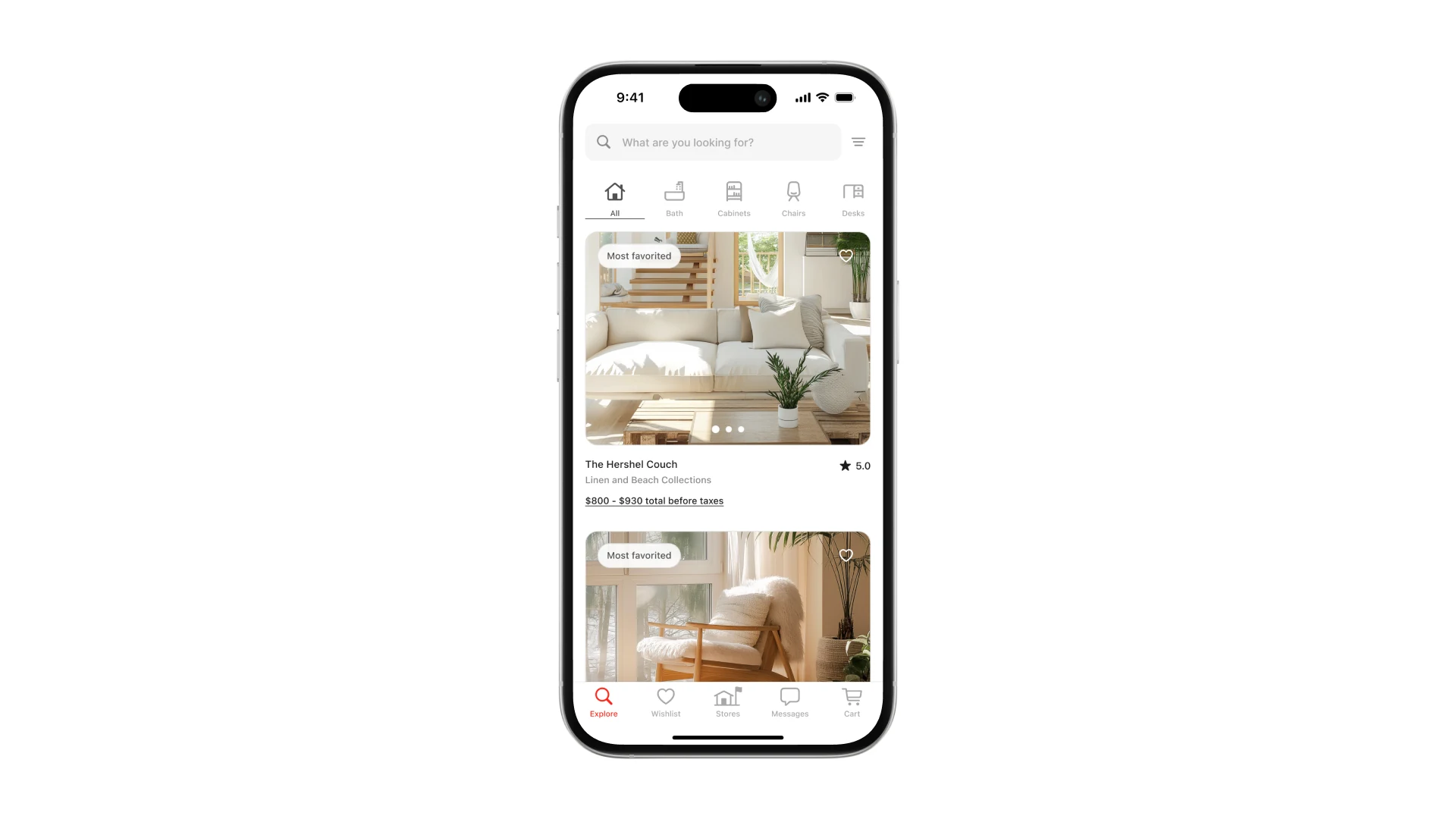
A redesign of CB2 mobile app experience.


A redesign for Experian’s dashboard.
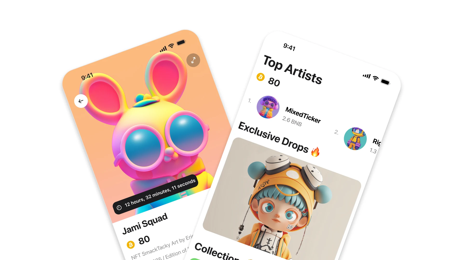
A crypto experience built to gamify NFT marketplaces.
Nothing here yet.